Liz was quick and concise about her art request.
Project Details:
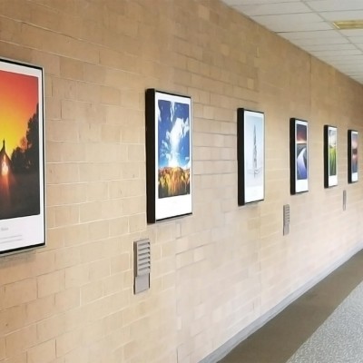
Huge white wall in conference room. We are located in Chicago. Looking for some abstract, ideas, etc. Thanks.
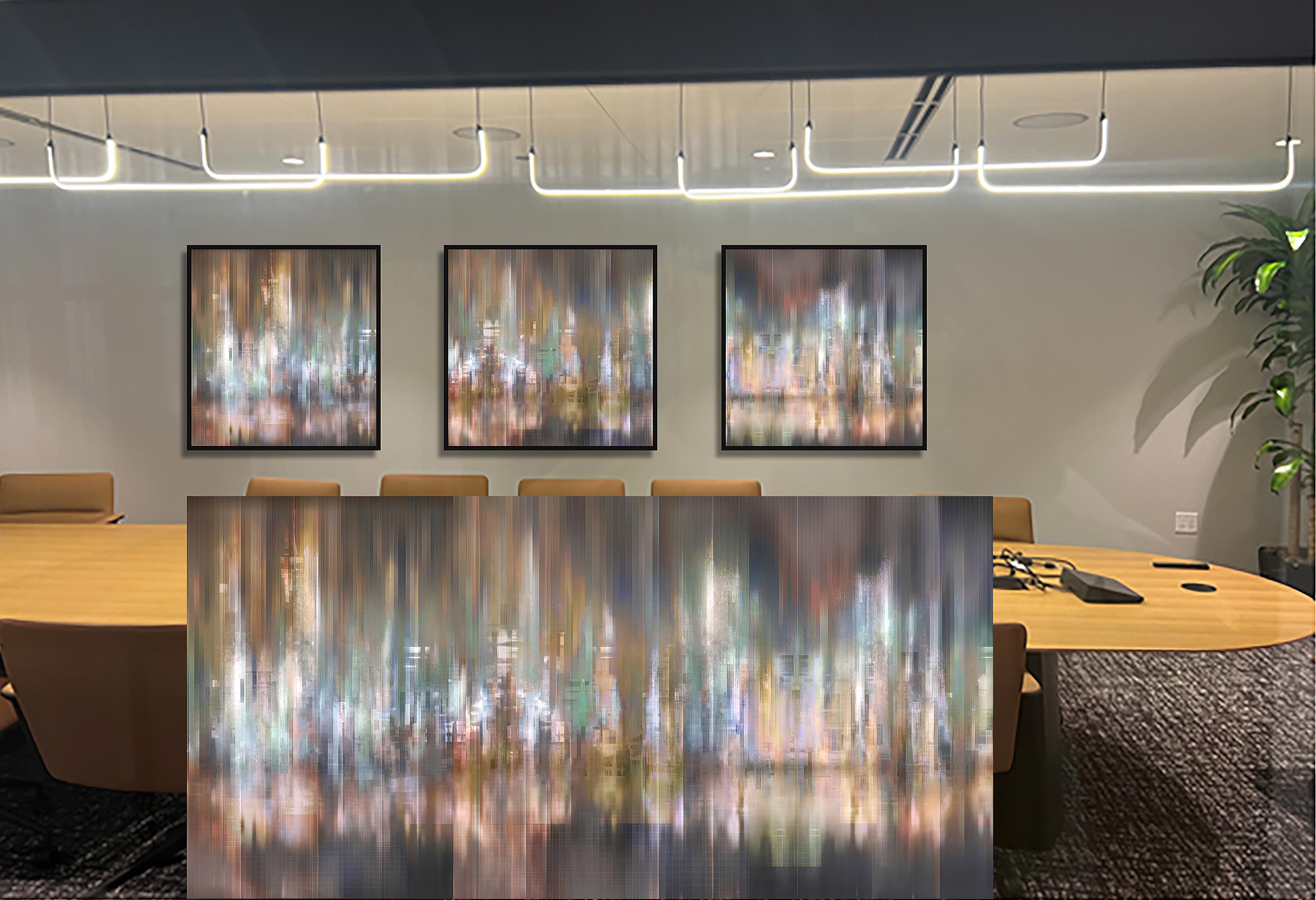
After investigating her company and taking a close look at her conference room, I couldn't help but notice the glowing modern lights. My mind immediately went to an abstract cityscape. Afterall, they were located in Chicago and couldn't resist presenting her with this colorful, modern abstract cityscape.
Passing this along to a couple of people in the office. Looks great! Is this Chicago?
This was actually conjured up from my imagination with inspirations of various cities. Was it the exact Chicago skyline--no. Could it be in your mind--yes ;-) A lot of my artwork tends to be a little ambiguous so that it can be applied to various projects.
This particular one was a pretty new one as I explored and created varied abstract cityscapes--and this one was my favorite called DISTRICT.
The team there came to a consensus:
We feel it looks like New York and we cannot have that! Any other suggestions? Do you have anything Chicago related by chance? Thanks Kyle.
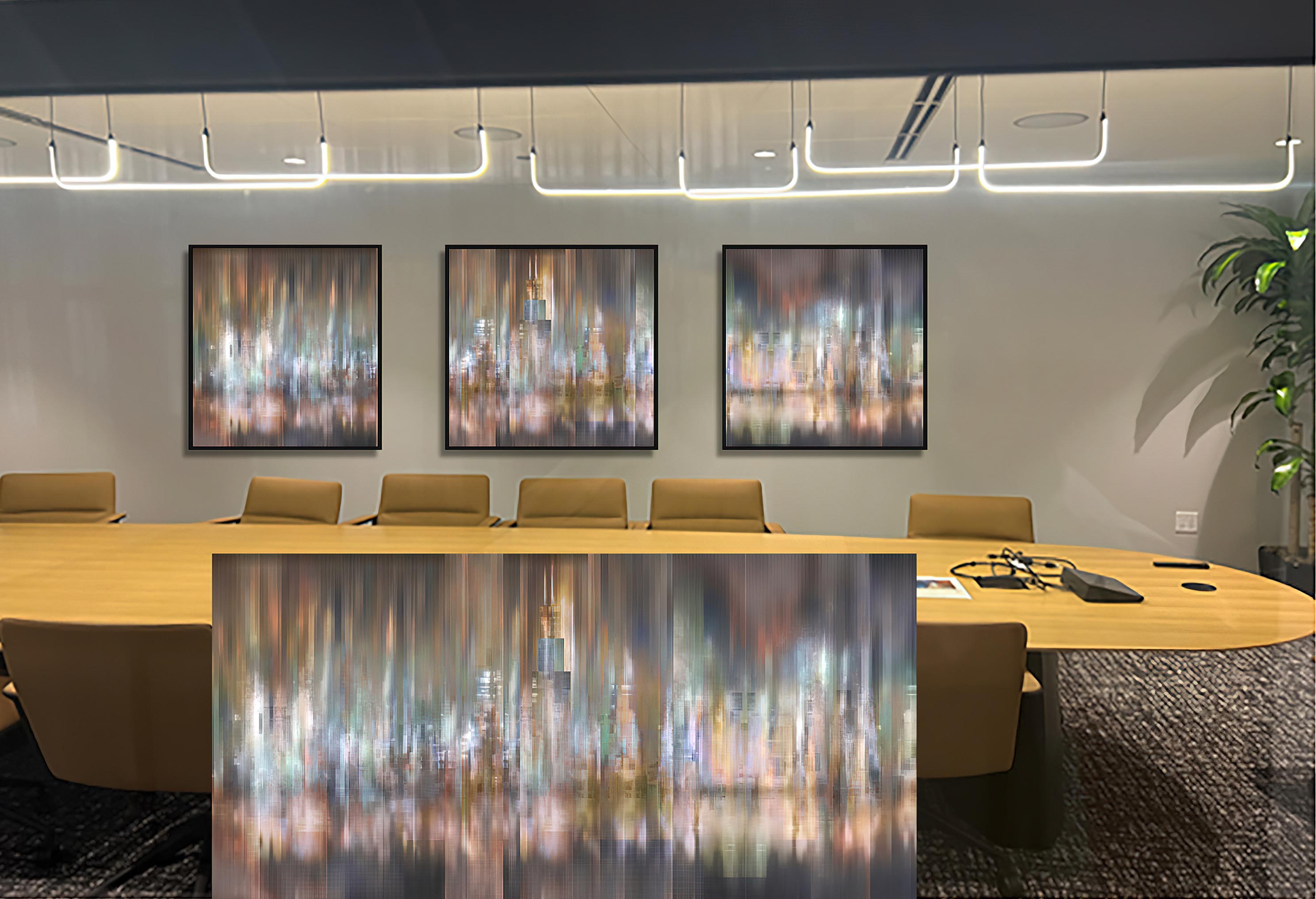
I then decided that maybe it was worthwhile to adjust the cityscape to look more like Chicago.
This is where customization of the artwork can make all the difference.
After reviewing multiple angles of the Chicago skyline, the main focal point of the Willis Tower was added to the center panel of the artwork along with a few other buildings to make the general shape of the skyline resemble Chicago. Unmistakably Chicago if I dare say so.
I was excited to show their team the customized revision to the artwork.
I think it's fabulous . I'll pass to the others and get back to you next week. Thank you!!!
Later that week, it was approved!
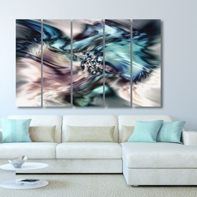
Now came the fun details to finish off the artwork to make it perfect for the conference room. Most imortantly, the size and style of the artwork was selected (canvas with frame).
In this instance I was 100% sure the mid-gloss canvas finish versus the matte finish was a night-and-day difference. There was a lot of light coming in from the window wall to the conference room, so with canvas there wouldn't be any glare. Canvas is a material that absorbs light and doesn't reflect it (like metal). This mid-gloss finish for the canvas was a way to make the picture "sparkle" to really pull out the highlights in the artwork. It's a subtle difference that makes a huge impact. By selecting the mid-gloss varnish, it will help pull in more light and actually make the artwork appear brighter.
Soon, the artwork was in production at the lab and on its way to Liz in Chicago. I couldn't wait for them to see it.
Then one splendid morning she sent sent me an email and it made my day!
Good morning Kyle. The artwork is a huge hit. Thank you!
-Liz
No Liz, thank YOU for giving me the chance to create a custom artwork special to you and your team. It's what I do every day, all day, and I love every single minute of it ;-)