I’m thrilled to show you a project I had the privilege to work on for Prairie Lakes Specialty Clinic. We all knew this was an atypical opportunity to keep the imagery relatable, yet offer up visual surprises to keep interest high and stress levels low.
With 65,000 square feet to outfit, I couldn’t wait to get started creating art for this hospital. Two years, 100+ artworks and 150+ panels later, I am ecstatic about these results.
Here's my best explanation of what is required when outfitting a space like this one:
Create a visual ballet intertwining the art in a perfect balance of sizes, shapes, panel configurations, material substrates, image variety, color variations, all in the perfect placements and sequences.
Easy, right?
Careful deliberation and intention when it comes to planning this would show itself in various ways in the end. It was time to put in the conceptual work before creating the actual art imagery.
Planning ideas and concepts (in my head) started more than two years ago (including gathering specific nature photographic artworks specifically for it), and my first preview of the space was when it was just a shell. It was a fun, creative, and wild ride.
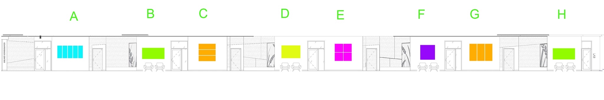
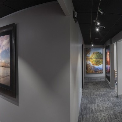
A full view of the hallway helped us conceptualize how to use a variety of shapes and sizes of artwork.
After furniture layout and quantity was determined, we took it a step further to really visualize what the art could become.
The grand wall
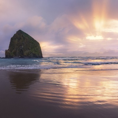
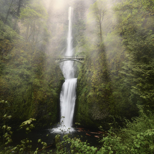
It was plain to see that the most important "art wall" in this gigantic space was what I call, “the grand wall.” It would be the first wall visitors would see, and a crucial first impression. I rant about this all the time about outfitting commercial spaces.
The artwork would be hoisted above an amazing staircase that flowed around the hospital. Captivating lights dangle to create depth and a sense of wow. All that was needed was an artwork that could tame this beastly wall and intertwine with its surroundings. It needed to pop the space, but could not be a garrish bomb. More of a reserved gem, if you will. This was an every-rock-turned exploration of creating a perfect artwork, and it still remains as probably my all-time favorite.
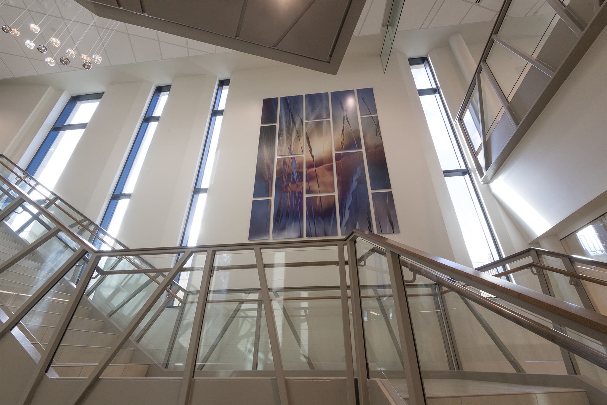
This grand wall could be seen from all levels, certainly making this artwork the most important in the entire space.
The wall would set the stage for the visual surprises to come next.
After this first impression, walk around the corner and a shiny abstract flower glimmers. Strategically printed on high gloss metal, the bouncing light from within the space gives the artwork the specular highlights it needs to liven the art. This is fancy artsy talk which means the sheen of the metal material was carefully selected based on the precise light conditions and image in those square inches of the wall.
Can you tell now that I'm just a little obsessed?
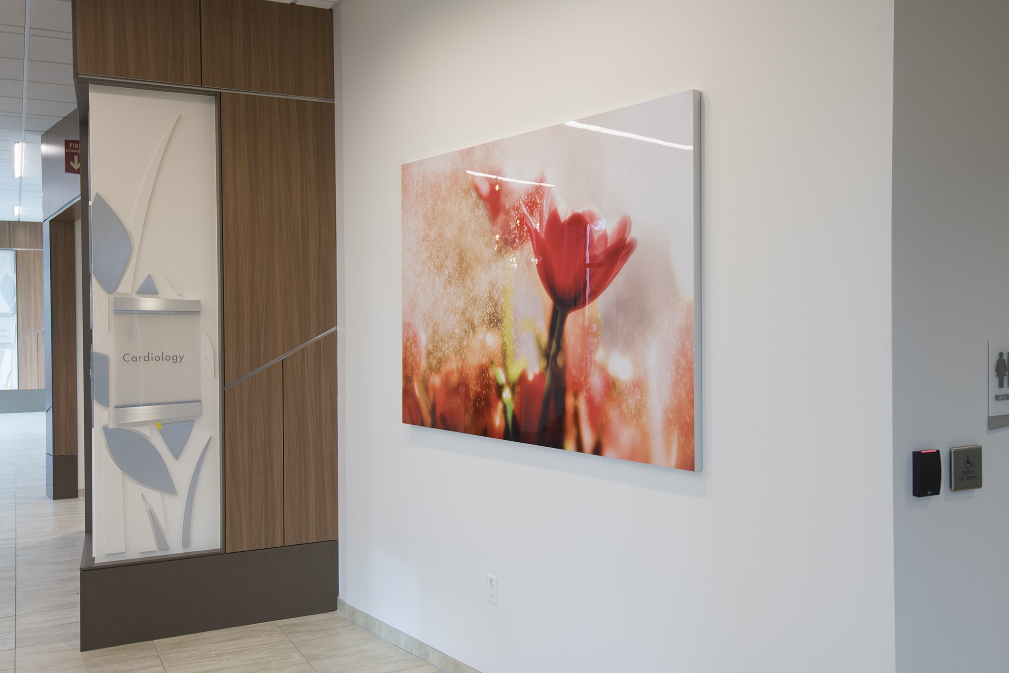
The high gloss metal makes this flower artwork come alive.
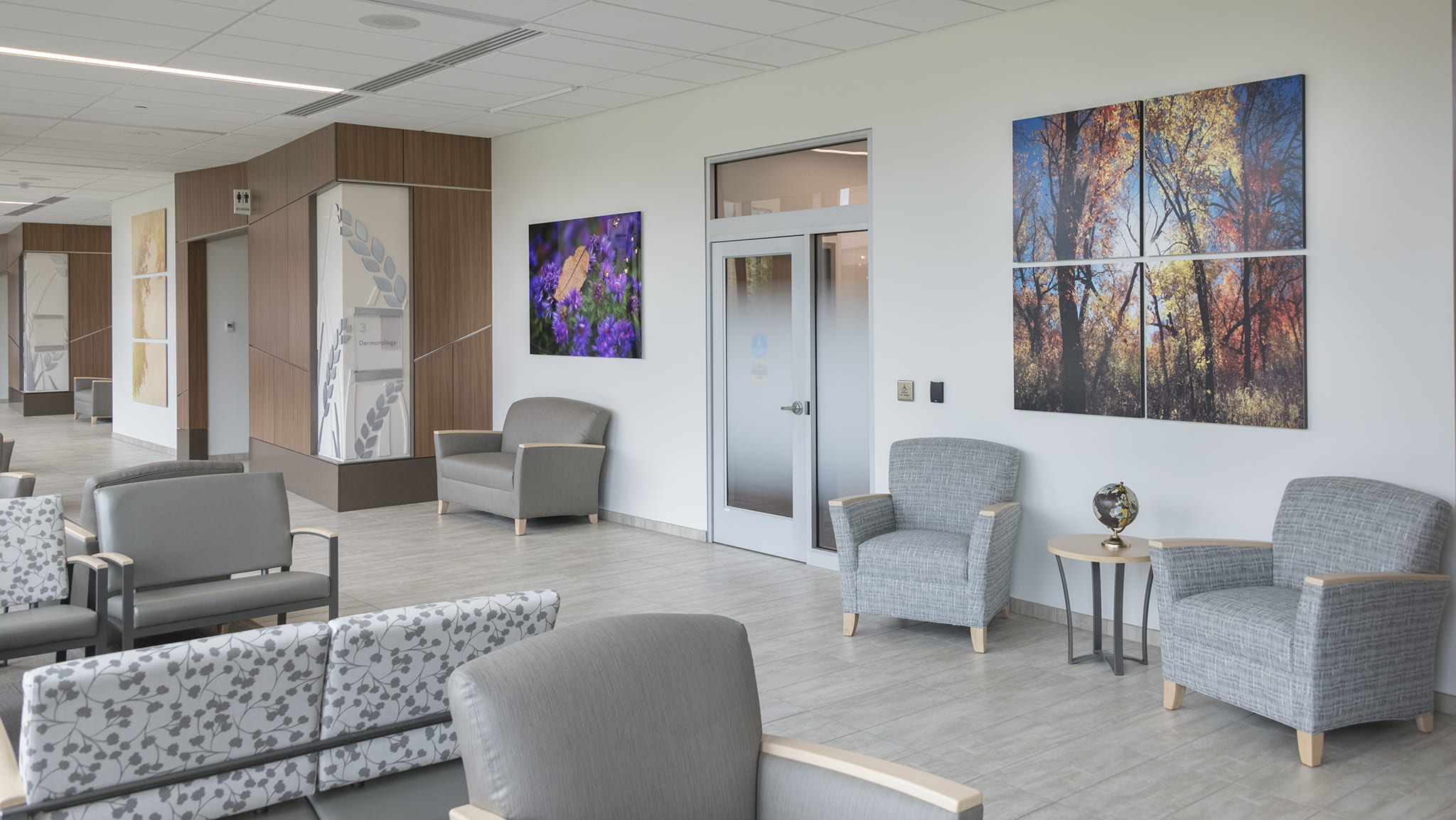
If something more simple is what you expect next, you will be sorely disappointed.
In fact, my hope is the visual delivery of each footstep to come is not what you expect. If you expect it, I have failed. Put simply--the objective is to lead the viewer's attention away from why they are here.
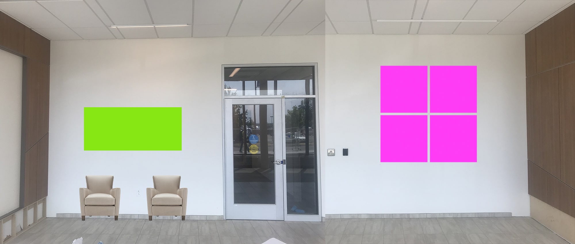
Next, canvas would offer up a different material, defeat the direct sunlight that hit them, and a swift panel configuration switch-up leads to another visual surprise.
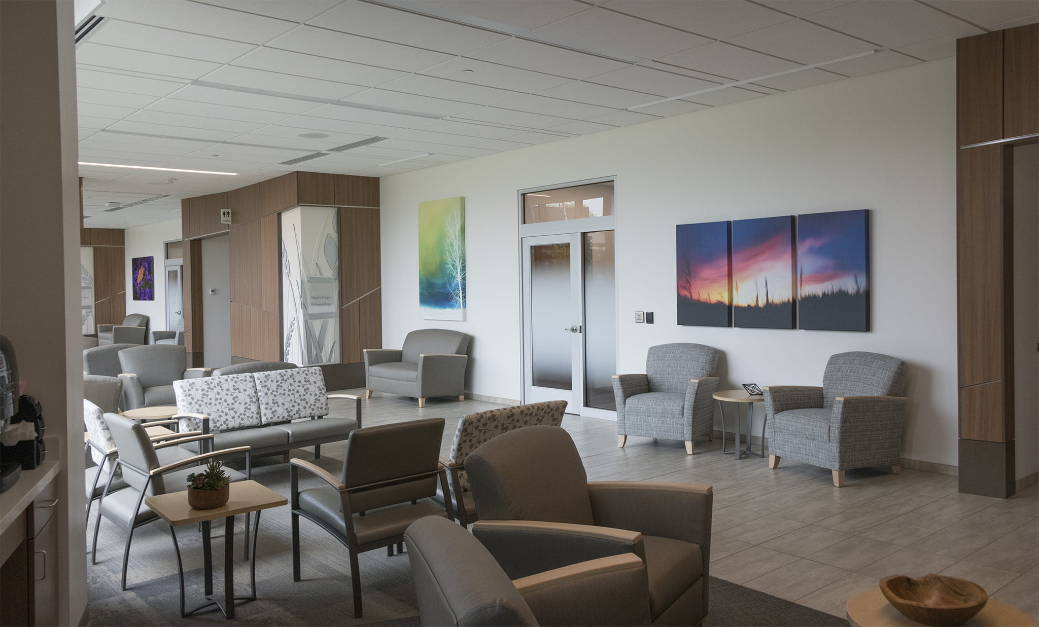
Having a vertical single paired with a horizontal multi-panel keeps the eye moving.
It was never too early to throw in a curveball with a mix of materials and panel configurations to lure your eyes with carefully considered color contrast.
The single panel acrylic (left) and the 4-panel metal artwork gives a super vibrant feel, all while keeping glare in check as much as possible.
Next came an oversized giant wood artwork made of three vertical panels.
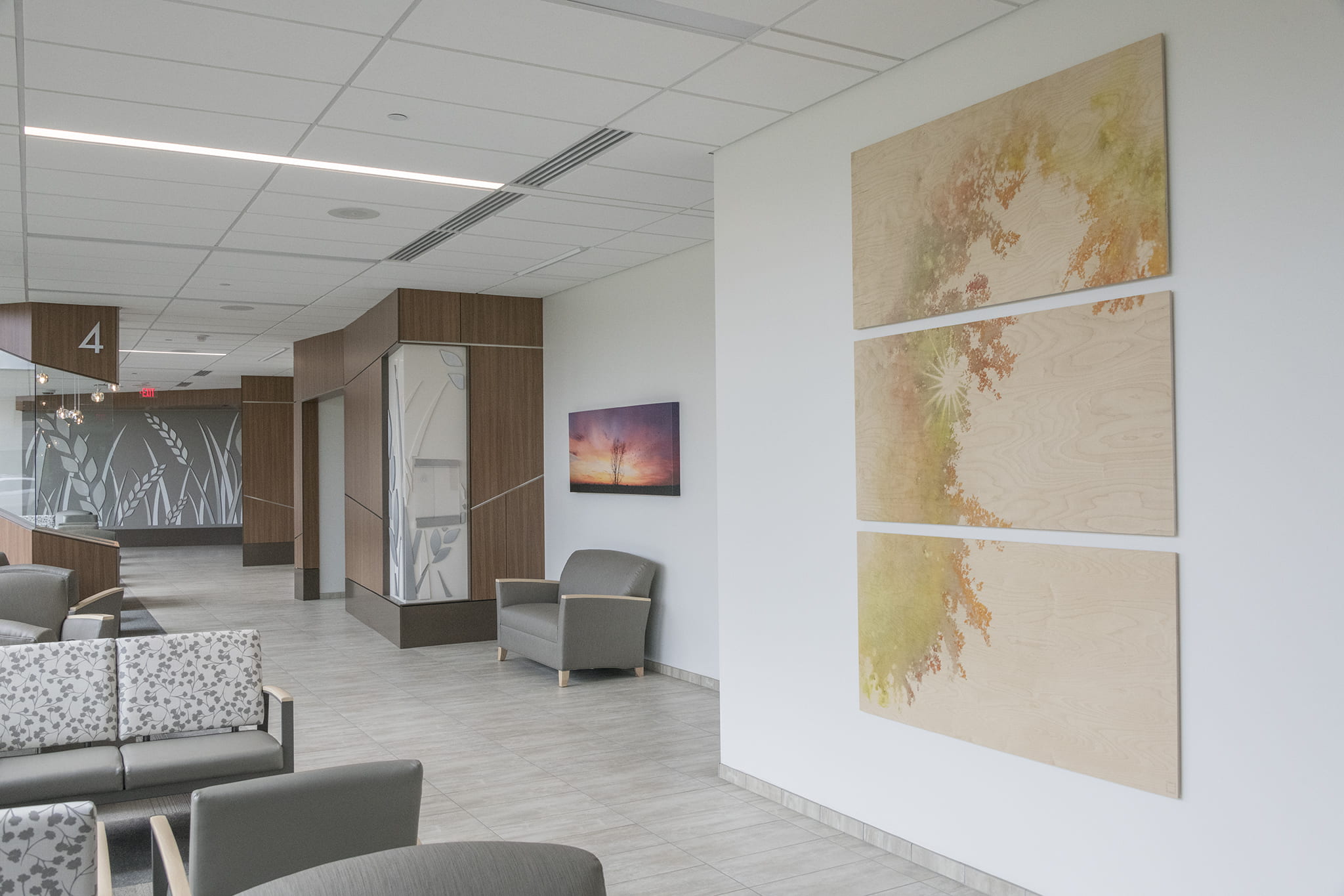
The elongated height offers another level of height in the space. Further down, a wide panorama canvas separates itself with bolder colors.
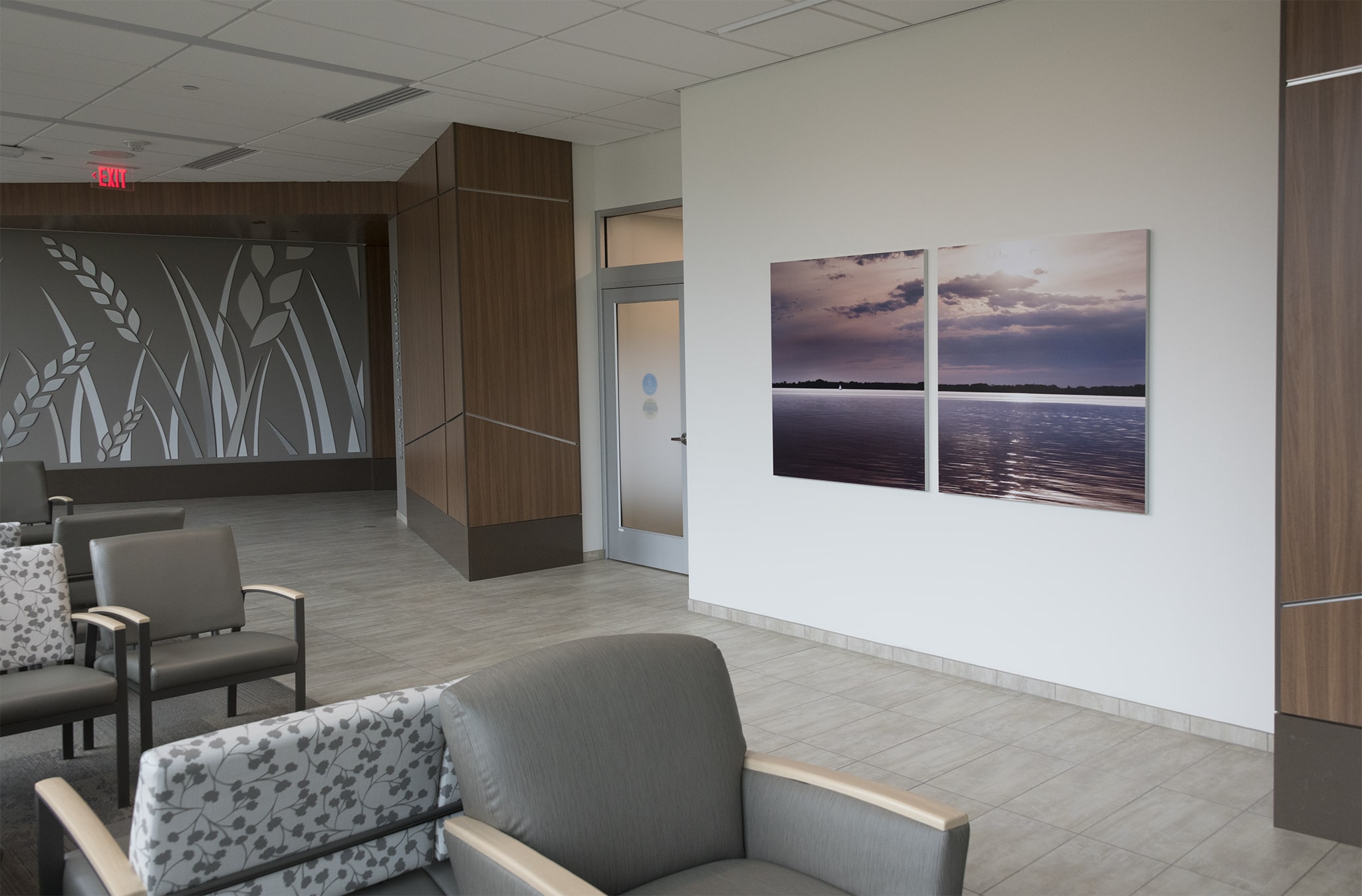
Finally, another new shape and panel configuration to finish off this open pathway.
Hopefully these surprises make them want to skip their appointment and walk around ;-)
Don't tell them I said that.
So let's keep walking...
...toward the Conference Center and be greeted by a couple of my friends, the golden geese. This artwork was created specifically for this wall. The shaft of light from the spotlight above hits precisely where it should--the reflection in the water-- to make it pop. The polished acrylic and metallic paper shimmer in the light.
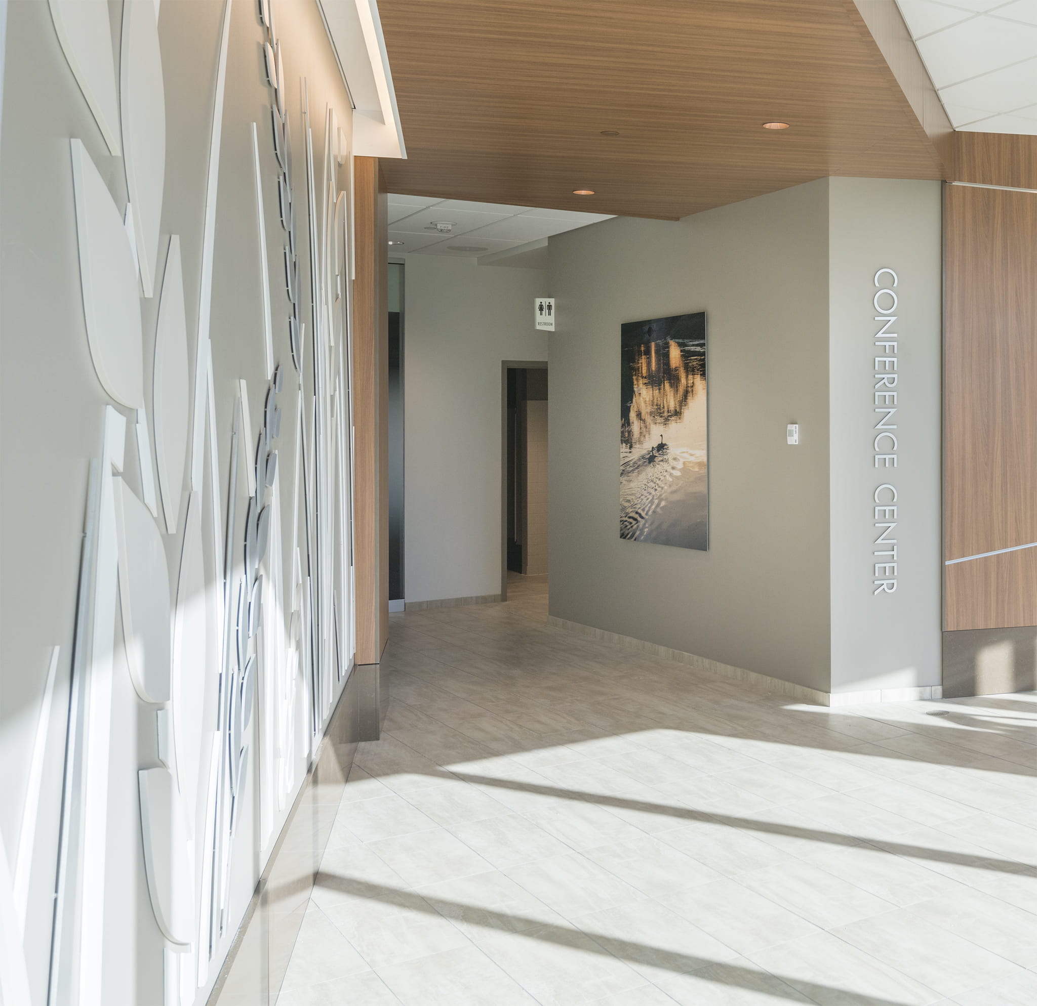
The color of the image pulls from the wall, and the intention and obsessive design shows on this wall I hope.
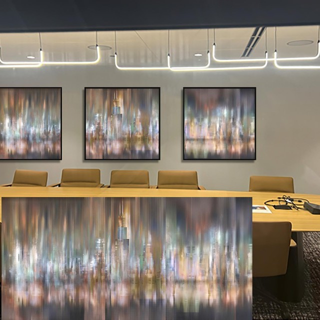
If we walk into the Conference Center, we are greeted by five wood artworks, featuring the intricate details of leaves with personality.
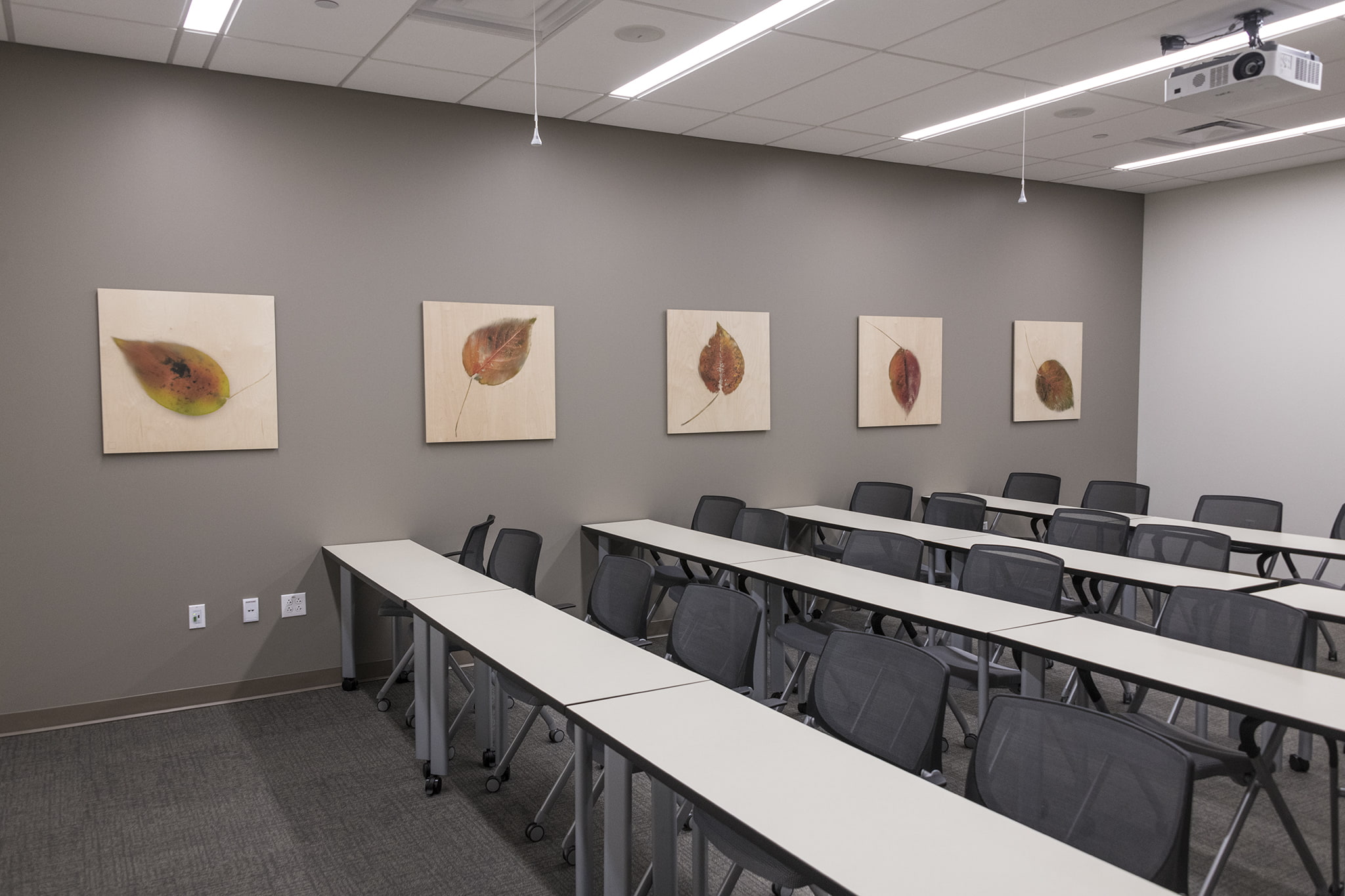
The spacing of the artworks within the tables and lights all make it come together for a deliberate design.
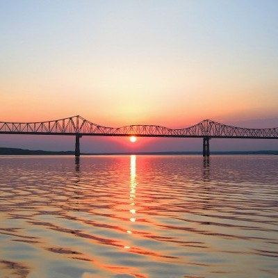
As we turn to the feature wall, a special image on metal lives in this nook. It is a local image of Watertown, and the light makes it dazzle, even when the main lights are off during a presentation.
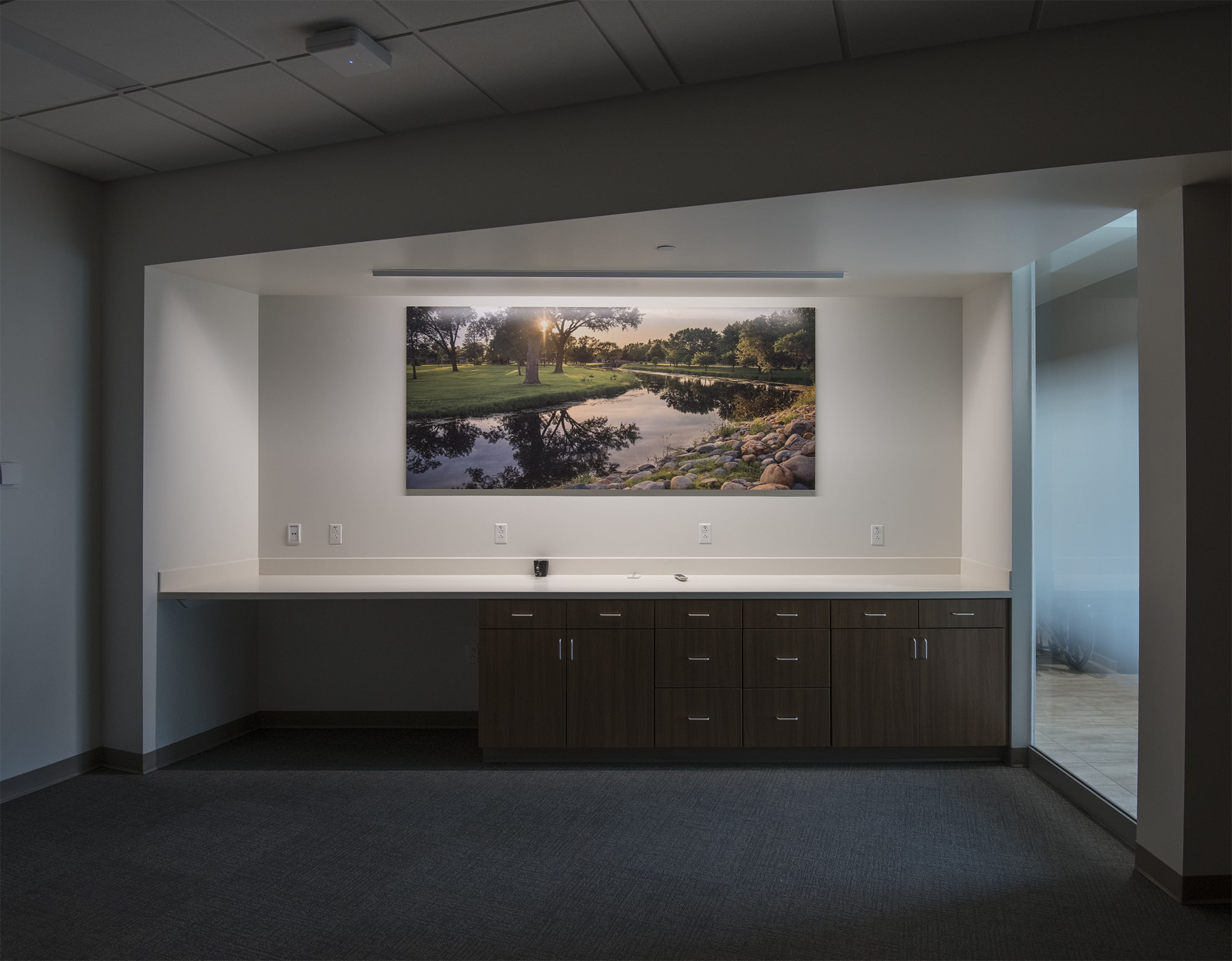
This scene presents a warm reminder of place, beautiful Watertown, South Dakota.
Want to see more? Let's keep touring and see more hospital artwork!