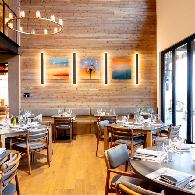
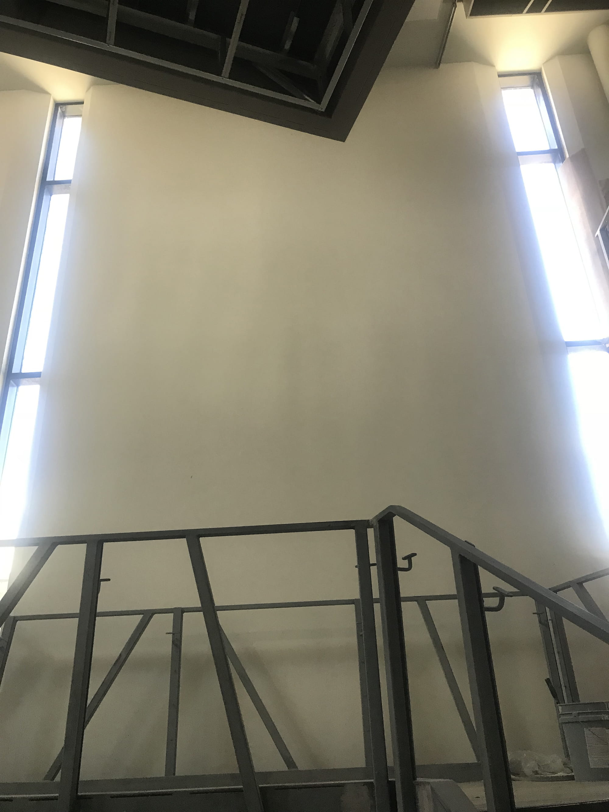
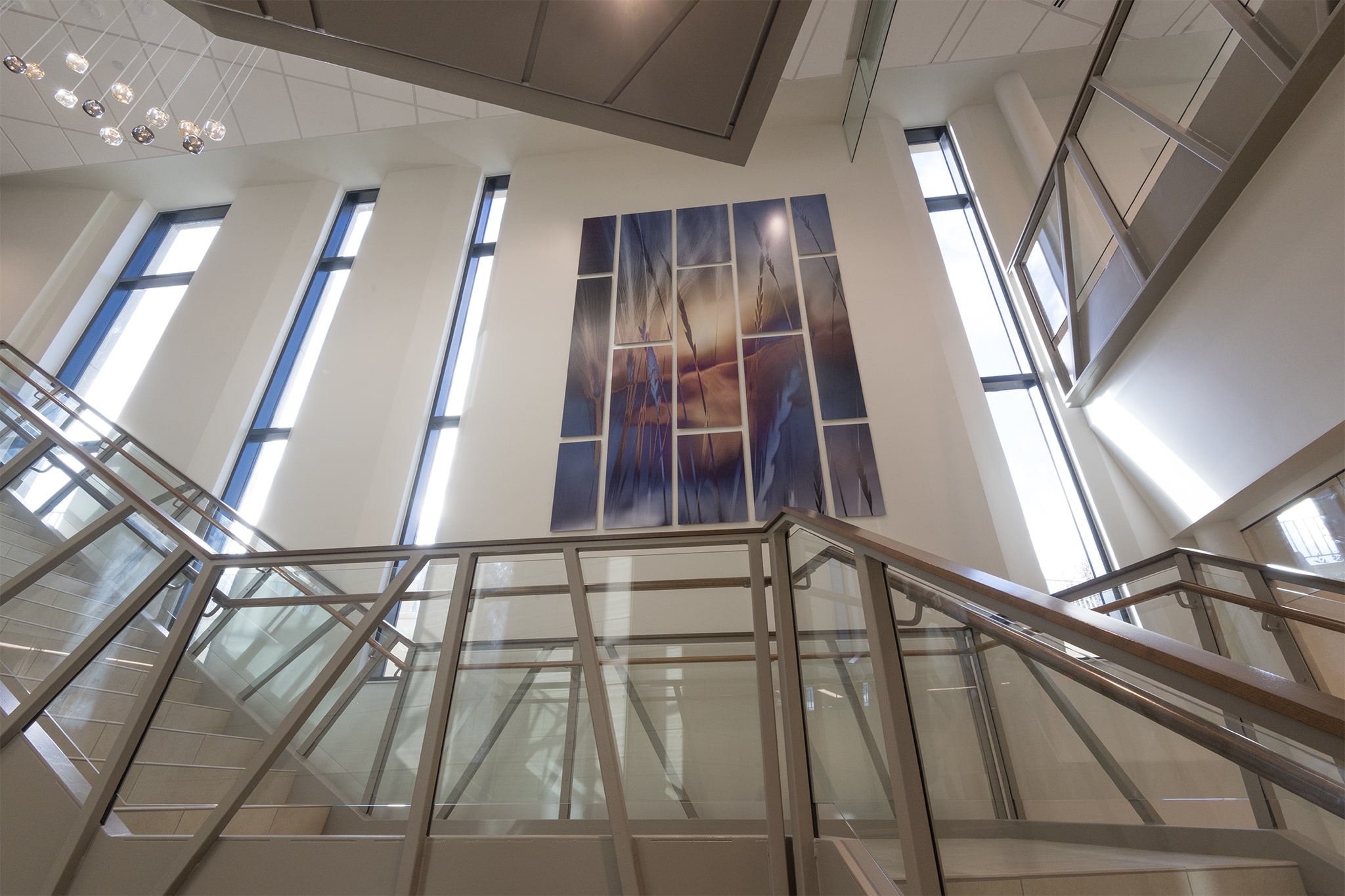
We toured the enormous empty shell at Prairie Lakes Specialty Clinic when we approached “the wall.” At the early stage here, a shy but huge wall that towered over the soon-to-be amazing staircase. With a batch of windows on each side of it, it was a particular span of desolate space that wanted to be noticed.
They kept walking, but I just stopped in my tracks and looked at the monstrosity of it.
This wall was going to be the most important wall of the entire project, and I knew it instantly.
I also sensed how difficult it was going to be. The challenge was to create something that had enough visual impact to deserve to be there. It had to relate somehow to the brand and feeling of the rest of the space. It had to fit the wall in size, yet be designed in a way that would pull elements from the other areas to make it feel perfect.
Oh, and then it had to be installed 18 feet up in the air.
Details.
I was captivated by the possibilities, and they could tell by my face when i just stood there stopped in my tracks looking up at it as they kept walking by.
They turned back to see me looking up at the giant.
“Are you going to propose we do something there?” they asked.
“Maybe.” My eyes didn't move from the beast.
I’m not a good liar. They could see my gears turning. They knew it wasn’t maybe.
The good news was I would have months to conceptualize and tinker with ideas.
And so it began...
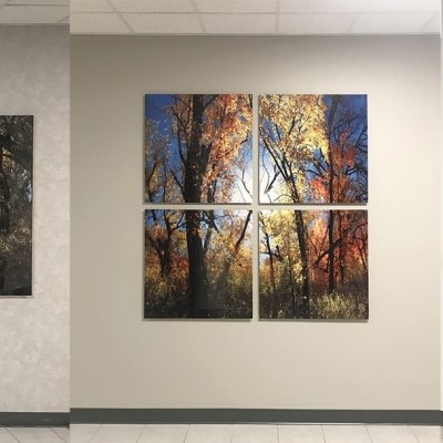
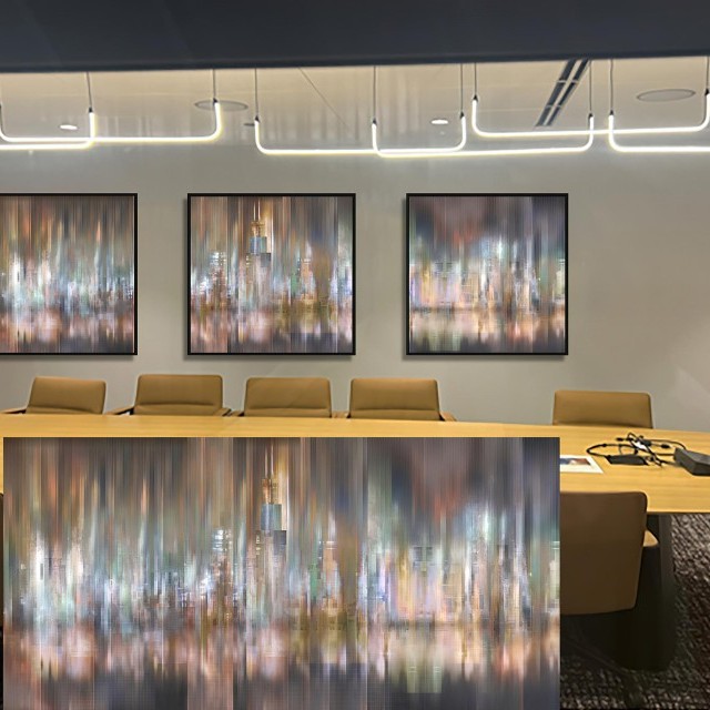
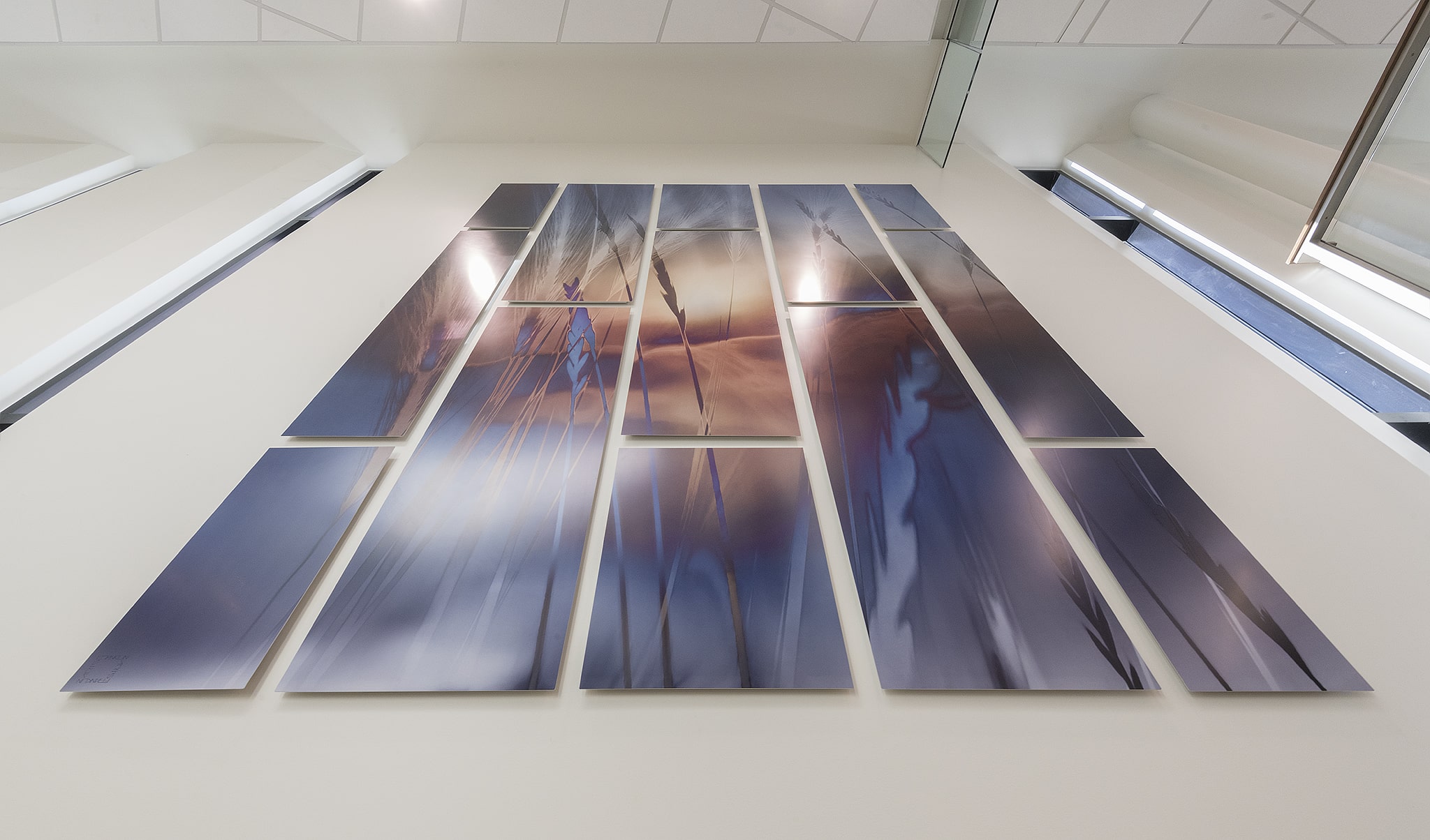
First was to conceptualize the design of the shape and configuration, and the main obstacle was to place panels together to fit into the space. One panel would be far too small for the immense size it had to be to feel right there.
The design came together naturally when its context in the space started to materialize as the staircase, elevator, and lights were installed.
The elevator stone had a tiled look with a combination of wide and thin panels. So, with that in mind, I took that precise layout and flipped it 90 degrees, to emphasize the sheer towering height of the space with vertical panels.
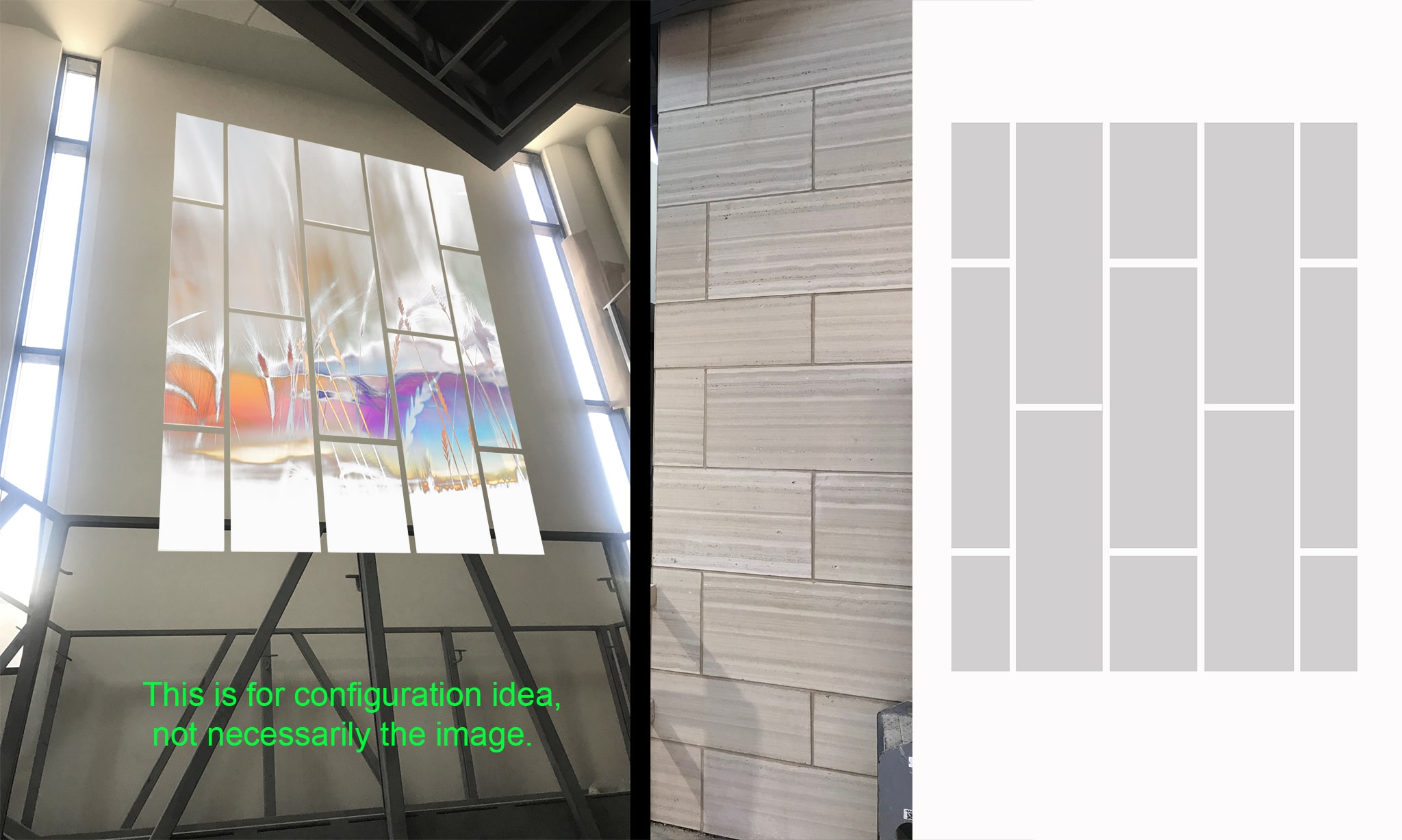
Taking the pattern of the subway tile on the elevator, we'd flip it 90 degrees to give the artwork a more heightened and vertical look to draw the eyes up. Plus, the line breaks would play with the other lines in the space.
The modern feel of the building already had some softer elements so we decided to use metal for some extra punch.
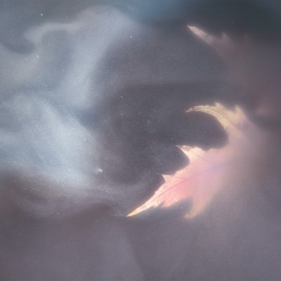
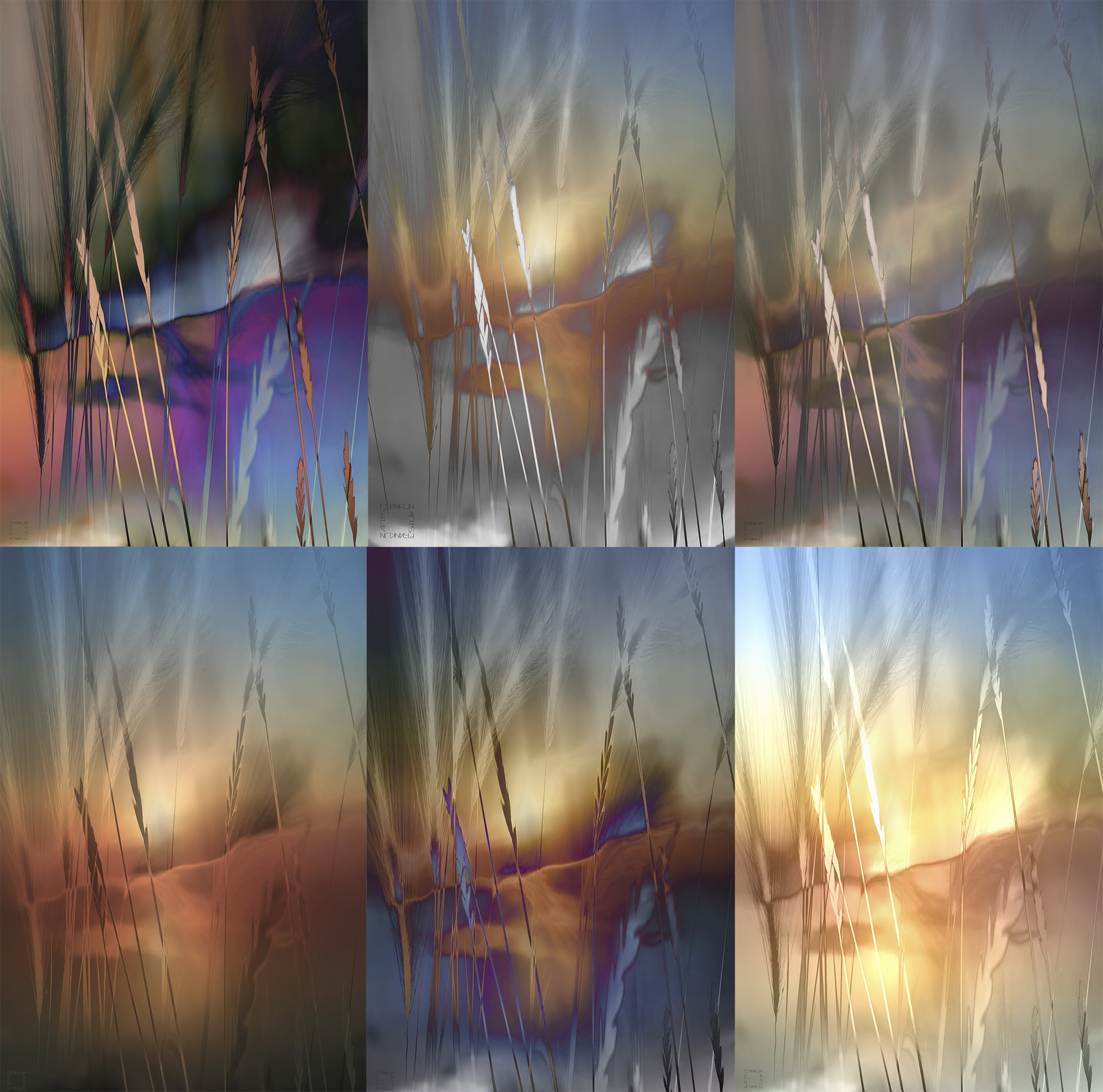
Now that we had the layout and configuration designed, it was time to start pulling imagery that would lend itself best to the panel concept. I was wanting something graphic, but I feel it is important to go through the exercise of overturning every rock, so I picked about 20 images—some more photographic and others more graphic.
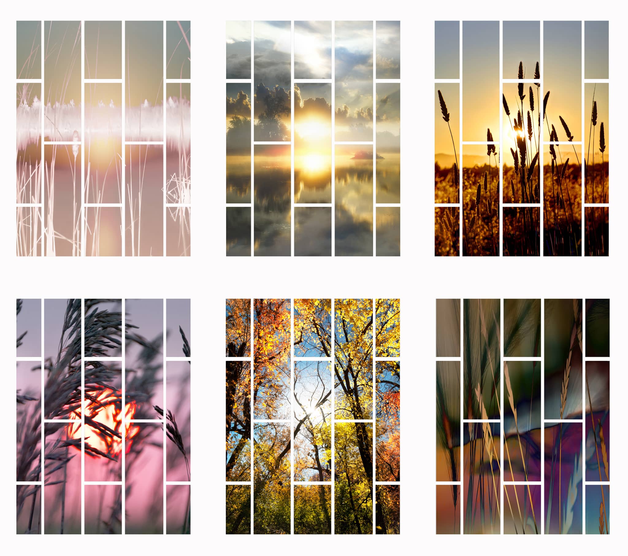
These were the top six selections. It was important for the images to contain interplay between the panels.
The design committe then picked their top 2 choices, and that’s sort of when I took the liberty to choose "the one".
I had a heavy favorite and my initial gut instincts took over—the art needed to be more graphic in nature, not a true photograph. It needed to have strong color contrast, variation, and branding. It would also pair with another entrance on the other side of the hospital.
So I chose the one that was more graphic with a stronger element of the brand at Prairie Lakes Speciality Clinic.
My job was not yet done. This idea was not fully executed…it was more of a preliminary concept.
So it was time overturn every rock.
Every single rock.
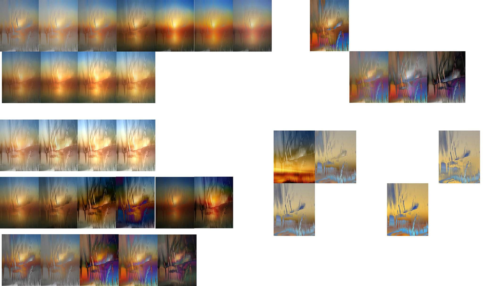
I made 120 versions of the same image. Yep. The beastly wall was breathing down my neck so I had to get it perfect.
I then narrowed it down to 6 options for the design committee to consider.
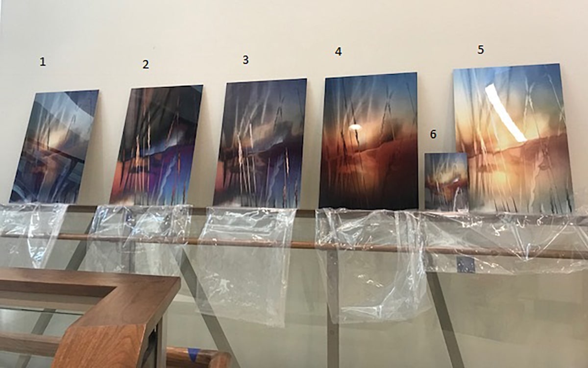
We then printed the top 6 on metal to see what it would look like in the space.
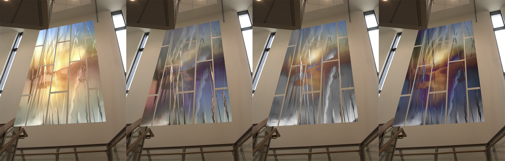
It was also quite useful to see each of the top selections placed in the space via a digital rendering (mockup.)
The final image was selected, carefully scaled, diced up with ulitimate precision, and then produced. No detail missed would be able to hide on this wall.
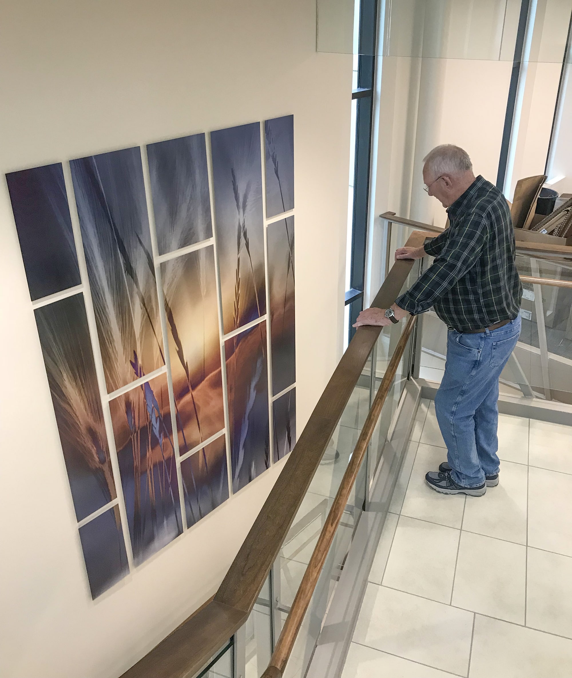
Now for the most heart-pounding moment---installation.
It was hard to sleep the night before install. Would it look the way I envisioned? Would we survive and not fall from the scaffolding or ladders? And by “we” I mean my braveheart superhero installer Tim. (I’m allergic to ladders that tall. Darn allergies.)
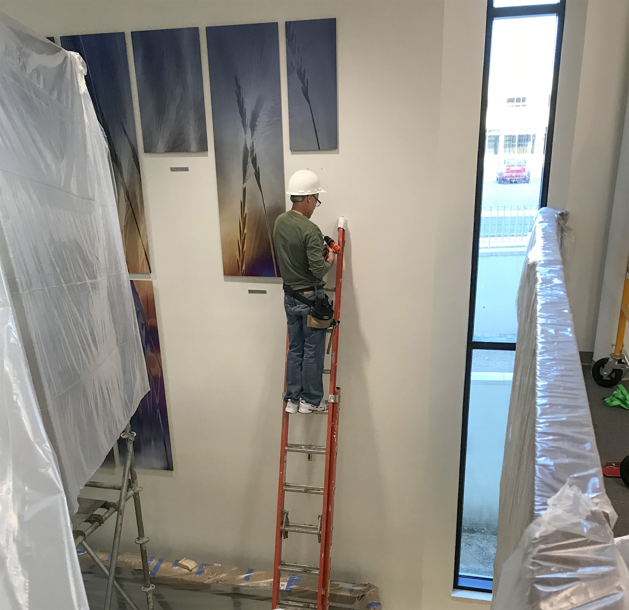
I handed Tim each panel carefully as he slowly installed one-by-one. It was pure heart-pounding magic to watch him install this elaborate creation.
It took many hours, patience, and endurance, but we finally did it!
And it was EXACTLY the way I envisioned it! Every single measure in the process mattered and that became crystal clear when it was done!
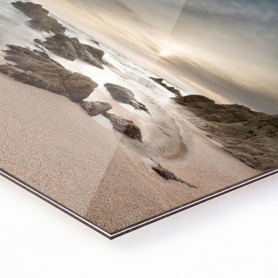
A crucial decision point was to select satin finish for the metal since the space was so vast and open, light would bounce around the space wildly, casting some unwanted glare on the panels. A satin finish was perfect to stop that from happening.
The pattern of the panels suddenly immersed with all of the lines in the space made it look even more intentional. This had every chance to be an impactful first impression since it would be the first thing you see walking in.
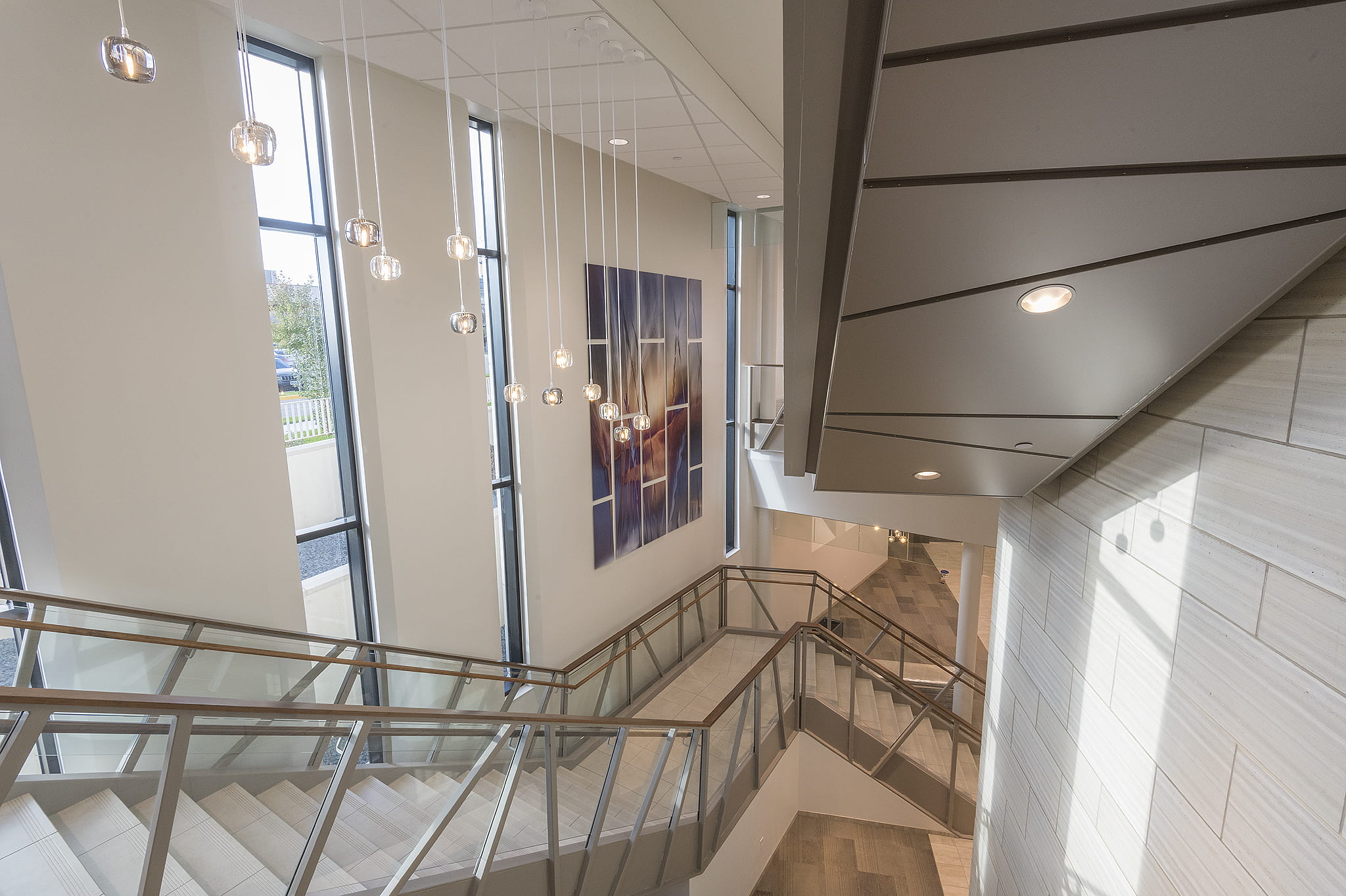
The view from the stair landing gave a whole different perspective. The panels float off the wall and this is magnified from here.
This main focal point can be seen from different levels.
We slayed the beast! Take that, you beastly wall, but thank you!! I’ll never forget you!
An enormous special thanks to the design team at Prairie Lakes Speciality Clinic, Tim, Darren and the lab crew, and everyone who helped this 9-foot wide, 11-foot tall, 13-panel "grandiose proposition" become a reality!