Exercising restraint usually means better design.
You’ve probably heard “less is more.” I’m a firm believer in this philosophy.
It’s easy to go a little overboard with anything in life. Shopping. Starbucks. Ice cream.
I can't believe I just said it's possible to go overboard with ice cream.
We probably know that if we did those things a little less, each time we did them, we’d enjoy each time a bit more, right? If things become too common, their special quality wears off.
This holds true when it comes to designing your walls.
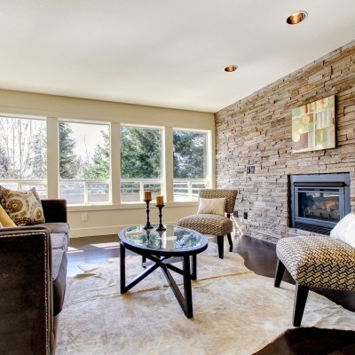
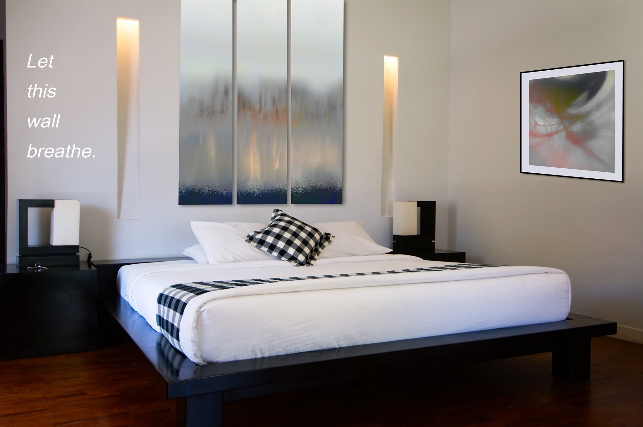
I think you should leave that wall blank.
Over the years, I’ve been saying that more, and as an artist, it surprises me each time I say it. I do know through various experiences with lots and lots of walls, most times less really is more. Sure, I’d love to stuff the walls with artwork, but what tends to happen is it can water things down.
Graphic designers have held on strongly to this notion of nothingness, and in their world they call it "negative space." Photographers use it too. We use it strategically to separate design elements, organize ideas, leverage it to convey a certain aesthetic, and to add emphasis.
This article about negative space explains,
Rather than trying to improve a design by adding more and more imagery, let the white space do its job so that you can simply focus on making the graphic elements look their best.
Here are some tips to ensure your artwork has proper punch, and that things aren’t too watered down.
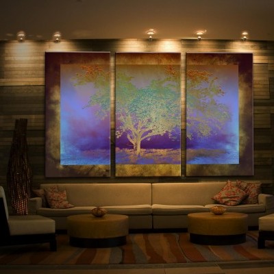
For this conversation, we’re talking more about traditional room sizes in homes and offices, not long or huge spans of space in commercial areas. When it comes to those massive spaces in hospitals, hotels, and large commercial spaces, the rules can tend to play out a bit differently.
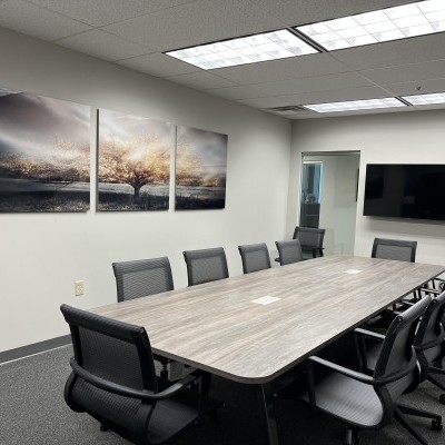
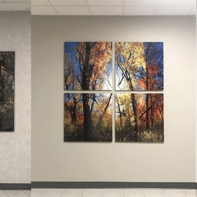
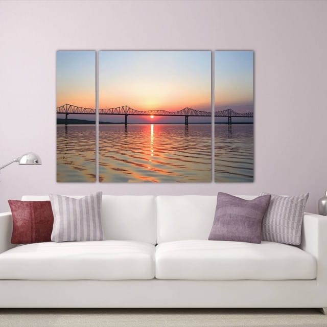
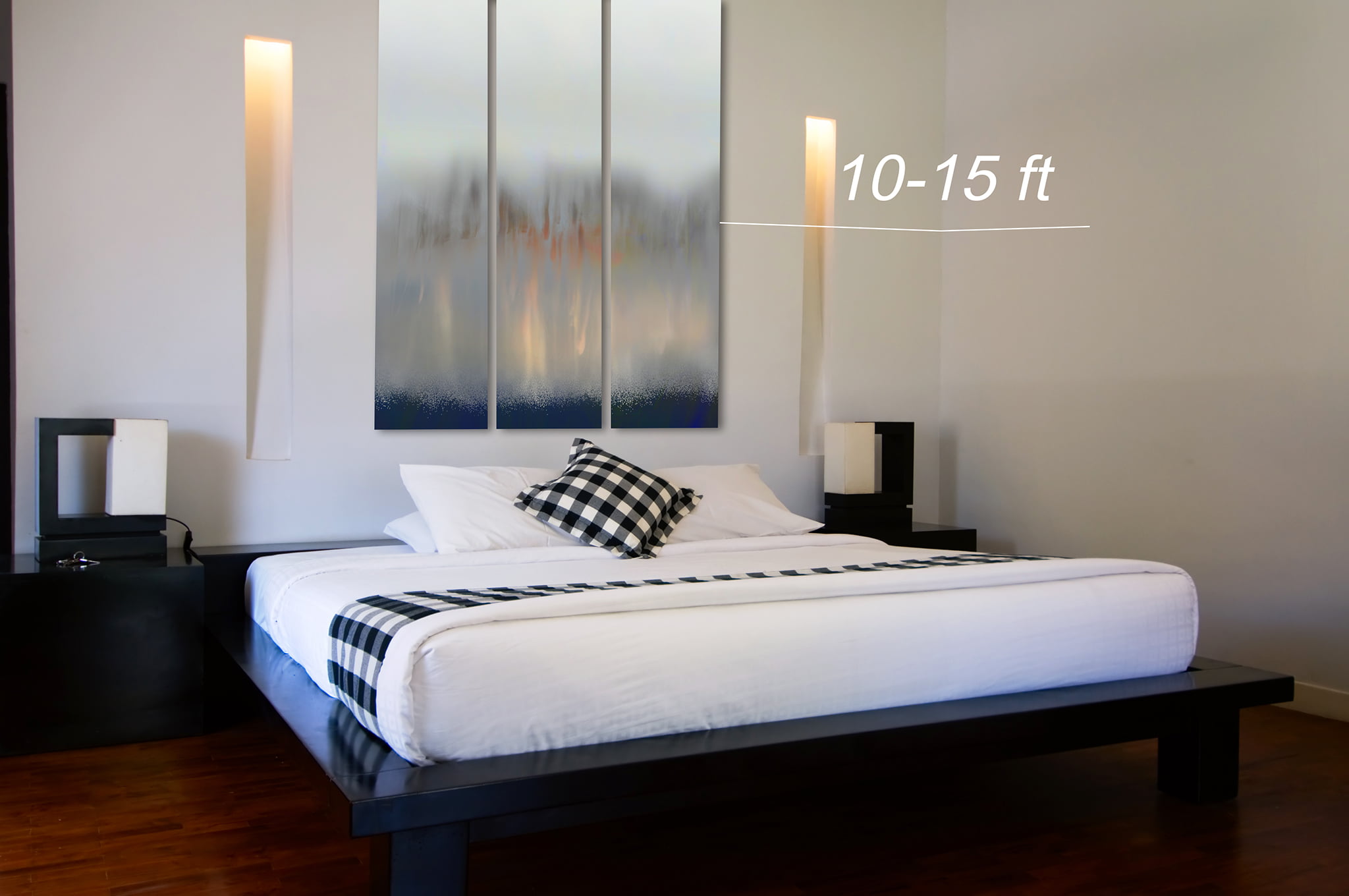
1. Select a focal wall to hang your most prominent artwork. This will naturally be the primary, or largest, artwork in the room, whether it’s one piece or a collection of artworks grouped together.
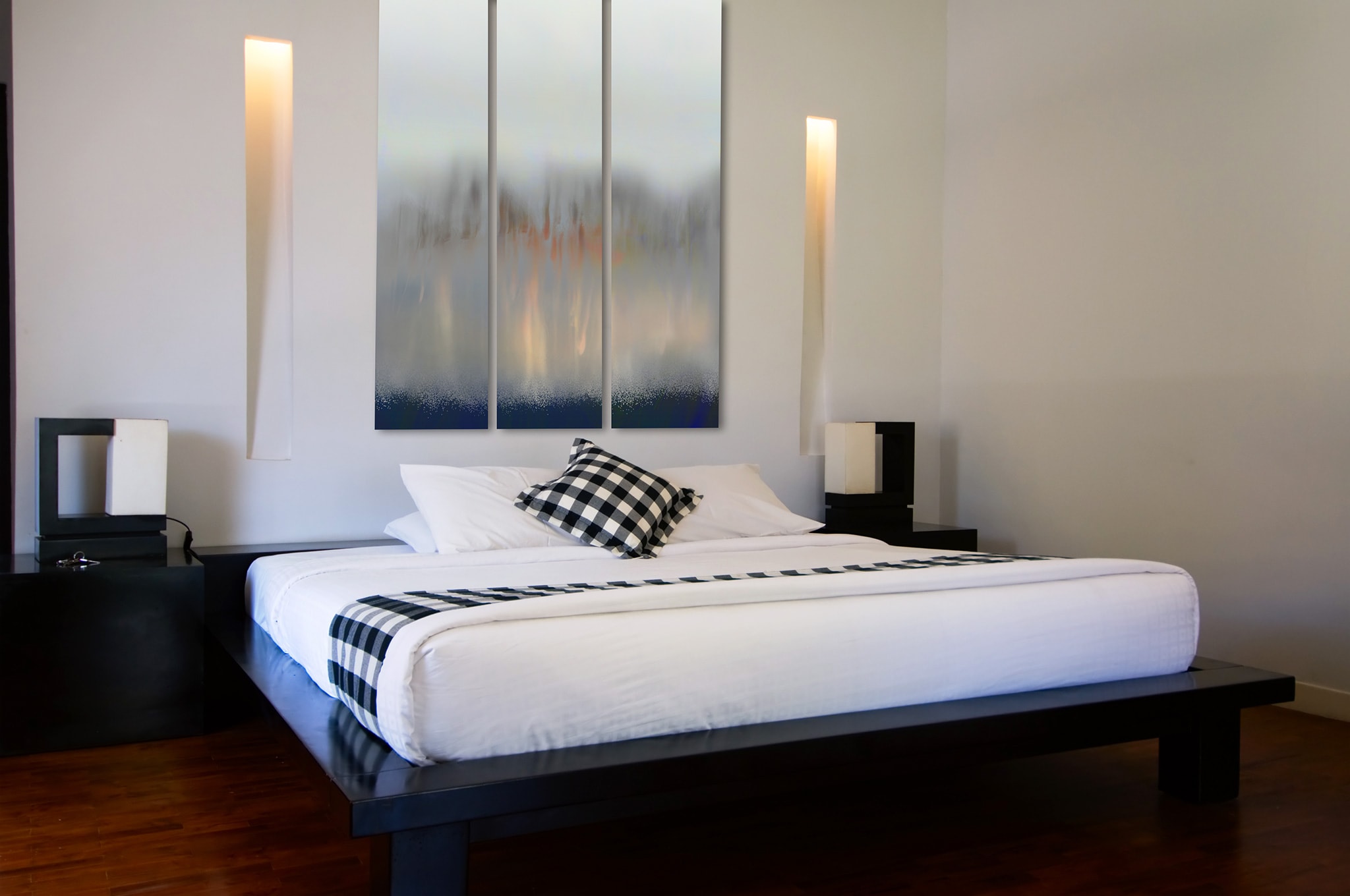
2. Leave at least 10-15 feet before another artwork begins on an adjacent wall. In other words, leave plenty of visual breathing room for the primary artwork to maximize its effectiveness. Give it room to glow.
3. Make sure your secondary artworks are smaller than your primary display. This gives deliberate weight and attention to the primary while the secondary artworks support it. Sometimes when you have two similar sized artworks, they fight for attention, and you’ll lose what good design is meant to be - a carefully designed order of visuals.
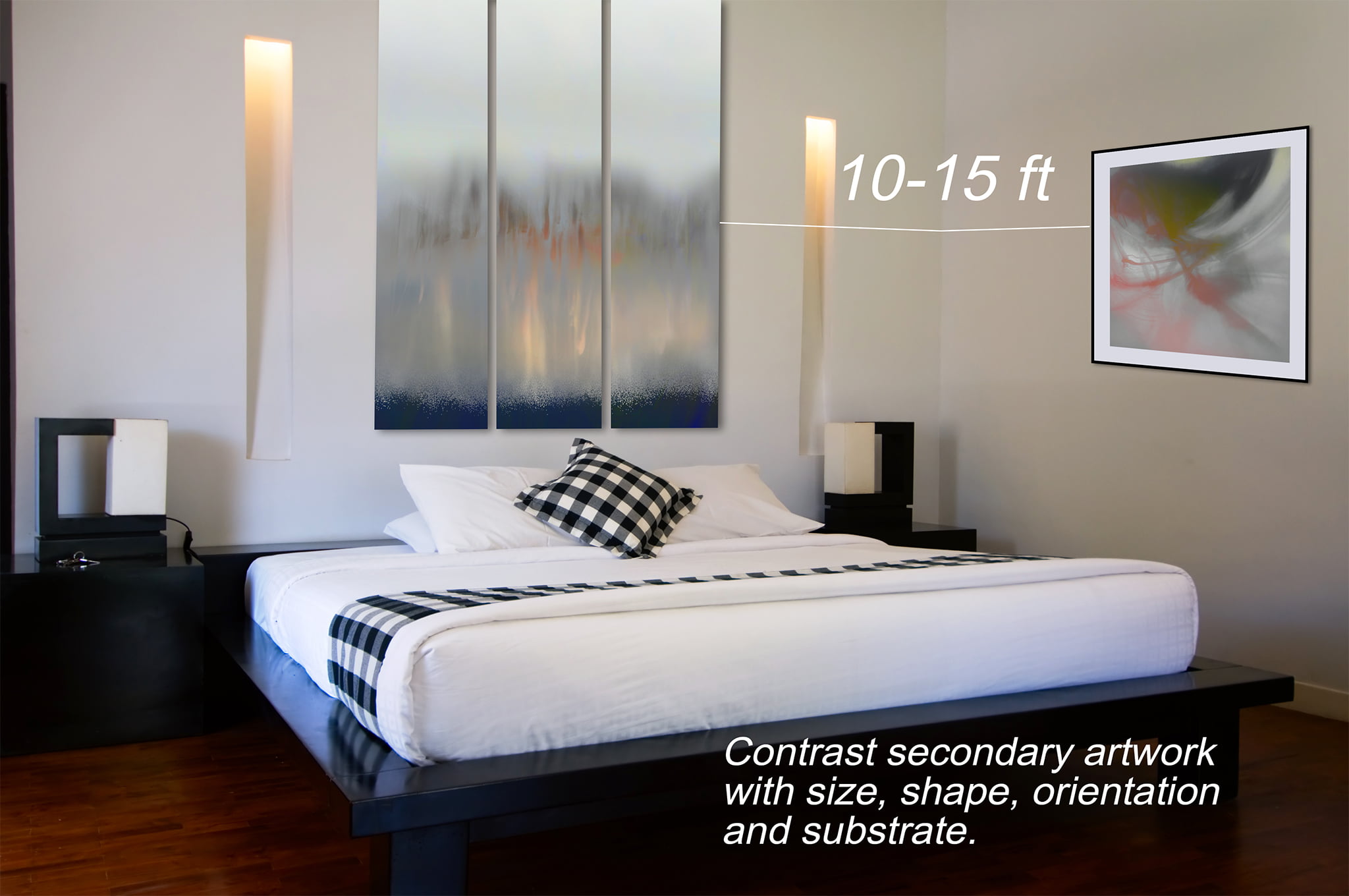
4. Hang the artworks on different planes in the room. In other words, make sure they are at different heights. By making them different sizes and perhaps even different orientations (such as hanging a vertical artwork as a secondary to support a larger primary horizontal artwork), this will help ensure they break things up a bit in the room.
When you’re not quite sure whether or not you should place an artwork on that wall, believe it or not, I would probably advise you to leave it blank. The uncertainty of the design choice probably means that you might be overdoing it. Leave it blank for awhile and if you keep looking at its bareness, then it might be time to get artwork for that wall.
Want ideas and a second opinion about what to do with your wall? Say hi, and I’d love to give you my honest opinion, even if it is advice to leave that wall blank.