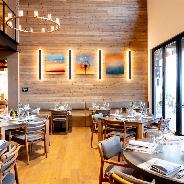
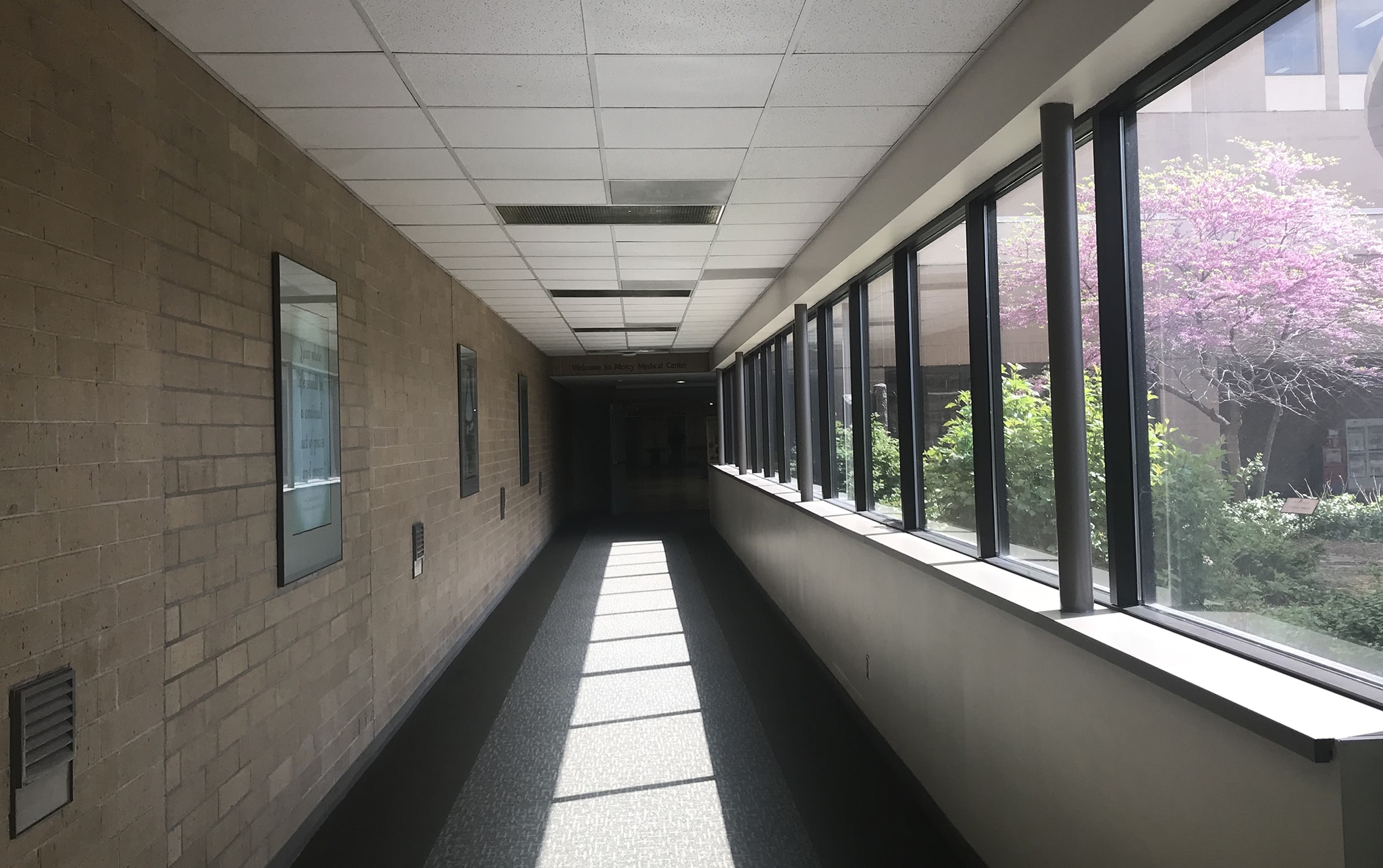
Earlier this year, Lea reached out to me looking to update a long hospital hallway.
Pros:
-Wonderful natural light providing openness to the space
-Current pictures offered purpose with special quotes, missions, and branding
Cons:
-The direct sunlight cast harsh glare on the current pictures, greatly reducing visual impact
-The hall lacked color and was quite bland and daunting
-Space needed updating and a more uplifting feeling
The hallway had wonderful windows, but it was evident that canvas be the best way to defeat any glare which was already prevalent on the traditional frames. Plus, canvas would offer a softer feel to the space that was already filled with smooth and hard finishes.
While Lea and I did some brainstorming, a detail surfaced, and that was the documented values and missions of the hospital.

Seven values plus one mission was perfect to align the hallway. The bonus was they matched up well to the windows on the other side.
We could use the missions and values to embed meaning into each picture.
We knew now it would be essential to intertwine the missions and values along with imagery.
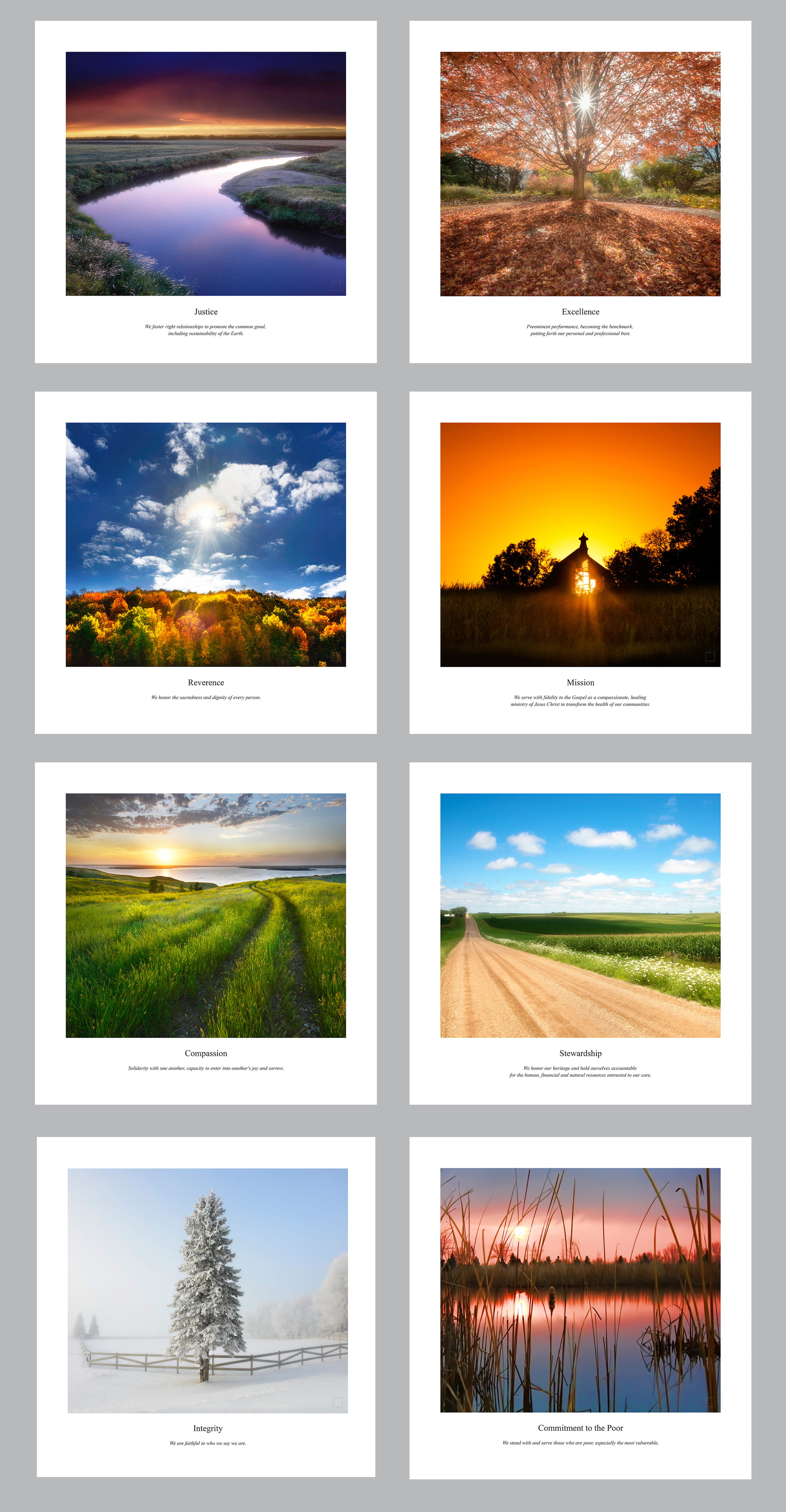
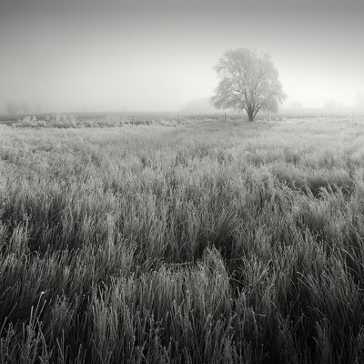
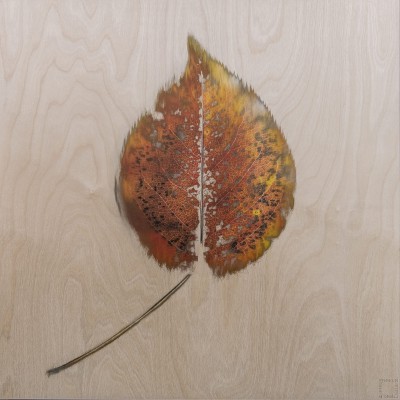
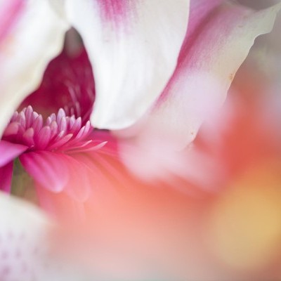
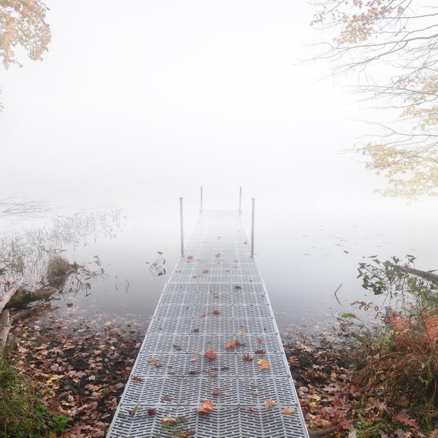
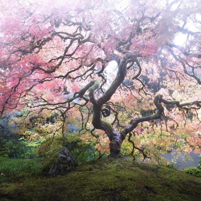
These concepts were derived from the idea. A careful blend of seasons and colors to really give the hall extra color boost it needed.
Throughout time and experience, the very best designs stem from intention. In this case, if we would properly honor each value and the mission statement, each image would stand on its own. Better yet, each phrase would have more impact.
The bonus is that the hallway itself becomes an intentional honoring of the values and mission while at the same time transforming the feeling and color of the space.
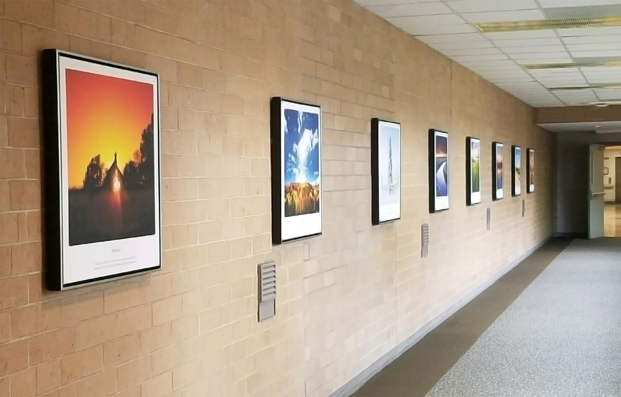
Careful intention leads to outstanding results.
I'm standing by, ready for your project!