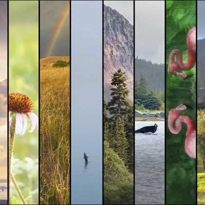
Throughout the years, I’ve noticed that many people find it challenging to pick out just the right wall art with their wall colors. Or, they have trouble knowing what color to paint the walls after buying some art. Many seem to think that you need red art for a red wall or blue art for a blue wall. While that is not entirely incorrect, wall art will have much more impact if you follow these guidelines:
Sometimes the unexpected color choice is the best one.
People associate a very common sense approach when matching wall color to wall art, and that’s okay. However, sometimes the choice of the colors is just too obvious and may not be the most appealing choice. After doing hundreds of art mockups for clients, I’m often surprised at how much I like one that I did not expect. It’s worth it every time to look beyond your initial first impression.
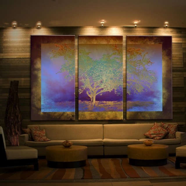
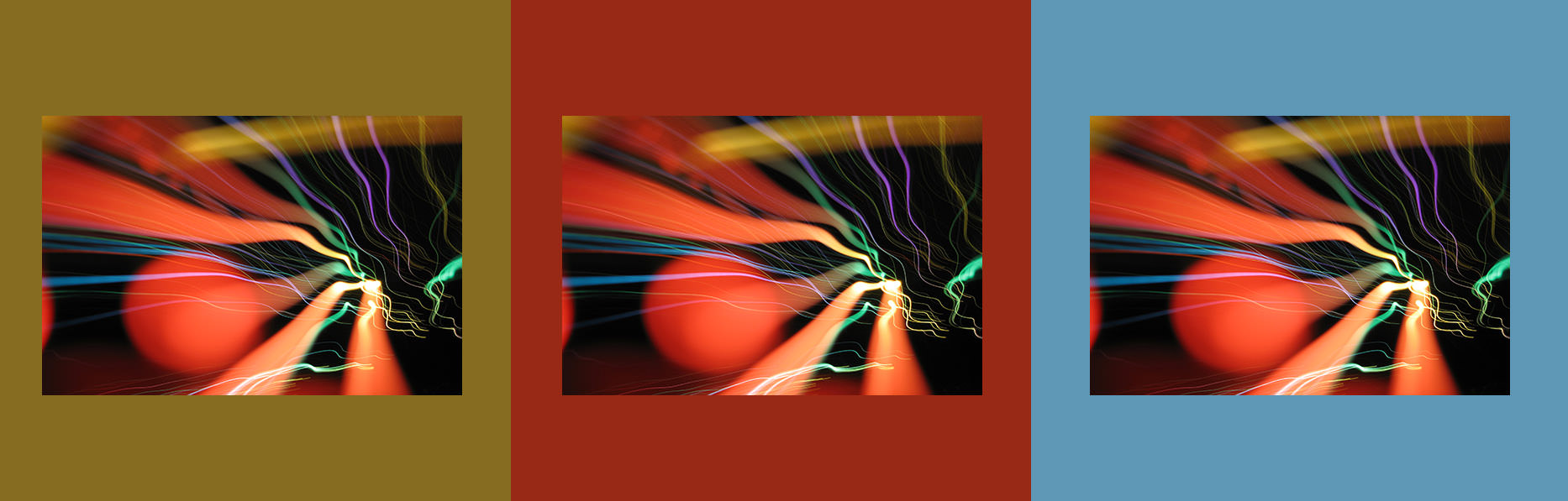
Let me illustrate. This piece called OPTIC below, I had originally selected dark orange since it seemed to be a fairly obvious choice. But then I tried a tanish-green and also a blue option and they presented a much more intriguing visual since they seemed to have more contrast with the art itself. Sure, it all comes down to opinion in the end, but the one that truly counts is yours since you’ll be looking at it more than anyone else.
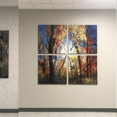
Choose wall art colors that compliment the wall color.
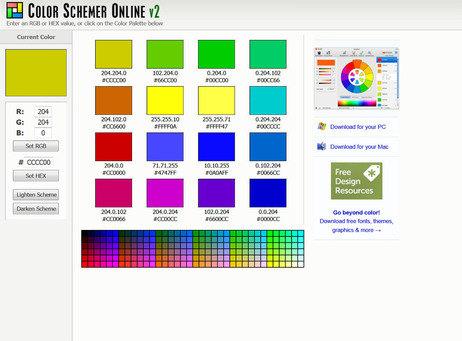
To get great ideas of colors that look great together, I recommend visiting a cool website called color schemer online which lets you select your base color and provides an assortment of complimentary colors. So, choose your wall color as the base and let the ideas guide you to the colors of art that will look great on your wall. Don’t be afraid to go to your local paint store and gather up a bunch of swatches, and yes, you can even hold them up to your computer monitor. Although RGB colors onscreen are slightly different than pantone color swatches, you can still get really good ideas of tones and colors that make a great match.
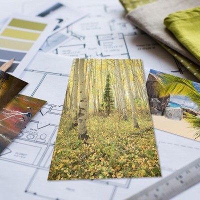
Choose a color sliver.
Selecting a small sliver or minor color in the art piece for the wall color is a great choice. This helps the artwork stand out and contrast from the wall, yet it ties them both together due to the common color, even if it is a very minor portion of the wall art color. You can never fail going down this road.
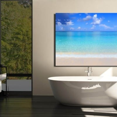
Gradients in your wall art will make color-matching easy.
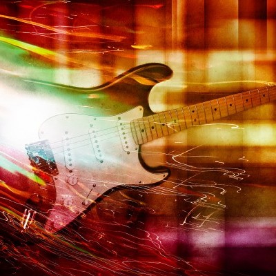
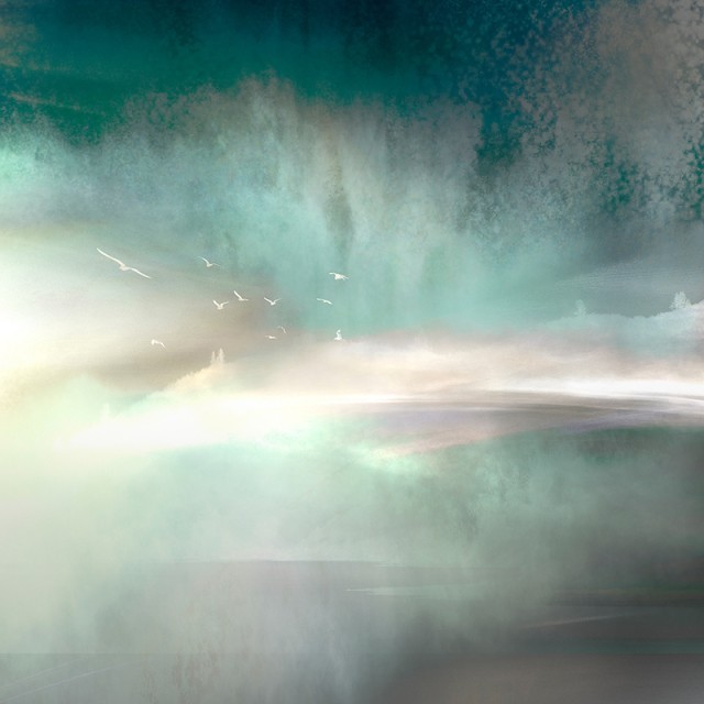
When I refer to a “gradient” this refers to a color that has different hues, shades, or levels of brightness within the same artwork, covering a larger gamut of a specific color. Take red for example. Red is color that can be somewhat of a nightmare since there are so many variations. Is it fire engine red? Is it brick red? Is it candy apple red? You get the picture. It might be worth looking at your artwork and choosing something that has some gradients in it so that when you hang it on your wall, it makes a perfect fit. Consider it to be a safeguard against clashing. Many of my pieces seem to be forgiving since they have gradients and or many colors within one artwork. Below is an example of a piece with gradients.
Think before you paint.
So this is really where I have to check my “artist ways” at the door. Let’s face it. You may not love the art piece forever and may some day want to get a new one. If your wall color is hot pink, that sort of limits the selection of your next wall art if you want to avoid repainting the walls. No, I’m not saying don’t be creative and bold, but be real. You can have intriguing combinations of colors without going overboard. For the record, when I was 14, it took me almost six months before my parents let me paint by bedroom black...I do know extreme! The funny thing was when I left for college, they kept it black since they loved it so much. You have to weigh the risk.
What should the mood of the room be?
Since wall art and wall color most heavily influence the room’s appearance, they dictate the mood. What should it be? Learn about the meaning of color.
What’s the style of the room?
Colors can often represent a certain style, so perhaps picking specific colors may reveal your style. Many of the styles are associated with these colors:
Casual: Earth tones like brown, tan, reds, olive, muted greens, orange, and gold
Contemporary: Neutral tones like black, white, gray, or bright solid tones
Country: Light blue, shades of yellow, warm reds, oranges, and natural greens
Traditional: Muted and lighter colors like light green, blue or soft reds
Nautical: Royal blue, green, yellow and tans
If all else fails...
Count on Franklin Arts to help you with your selection. If you have a wall color already, take a picture of your room, and you can see different options in your space before you buy it with my approach called "Envision It." I’ve been helping people eliminate the guessing game for years, and I would love to help you as well.