Would you build an intricate house of cards and then point a blowing fan right at it?
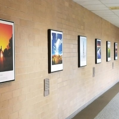
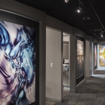
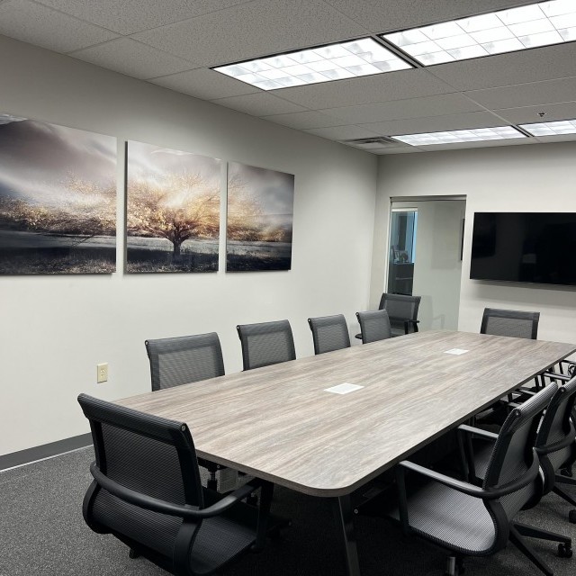
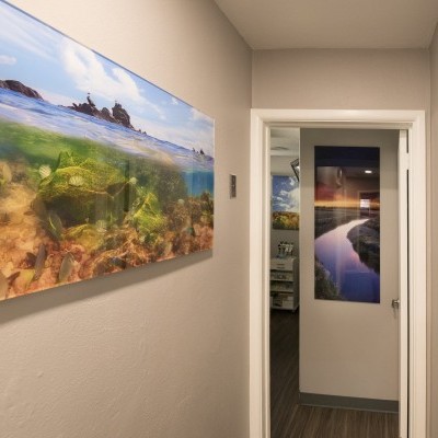
Sadly, this is what we do to our wall art. We point ugly light at art we care about.
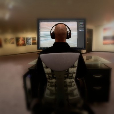
Like many artists, I go through excruciating measures to make sure a visual image is conveyed in the way it was intended. I will obsess about white balance, vibrance, saturation, shadows and contrast from the day it is captured in the camera all the way through extensive digital post processing. I've calibrated my monitor so the colors I see are as close to the final print as possible.
In other words, I am kind of crazy and go through as many steps as possible to ensure the image I create looks the way I want it to on the wall.
Despite that, those details can be suddenly thrown away by hanging the artwork. The culprit is the light cast upon it.
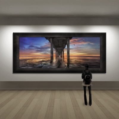
I've already talked about how light gives art life, but let's talk specifically about lighting artwork with spot lights (the actual lamps inside), the best way to make art look its best at all times of the day.
If you are bored by the details below with my experiments and results, here's my final selection as the best lamp possible to light wall art.
It's worth mentioning I've researched and read countless articles, including scientific studies, and simply wanted to see for myself, so I invested many days making sure I get it right. Afterall, 2017 will mark the opening of my public gallery, and I'm doing the lighting as well. It's an outstanding excuse to know more than I should about lighting artwork.
I'm going with a 36 degree CRI 95 R9 95 4000K SORAA "Vivid" lamp.
Here are the fascinating, nerdy details explaining my conclusion:
1. Today, we can safely say that LED lights are a solid (no-brainer) choice. They are energy efficient and these past few years have allowed manufacturers to really nail down color temperature and the color rendering index (CRI). It's not to say your standard halogens are terribly bad, it's just that it makes more sense to use LEDs. Don't think twice.
2. Color temperatures have been introduced to us in the public, but still, the biggest obstacle we face moving toward different (higher, whiter) color temperatures is that our eyes are used to seeing low color temperatures (warmer, orange) light. When we see whiter light compared to orange, warm light, it "seems" blueish. But it's not.
3. You've probably never really cared about lighting because what you see is what you get. Perhaps that natural sentiment should be questioned. Have you ever gone to buy a TV at a big box store and see 3 or 4 screens together? You can actually see subtle differences between them. When you bring it home, the comparison falls away. But don't you still want the best one that looks the best to you?
Light Terms & Vocabulary
K - Degrees in Kelvin. As in 5000K and 2700K. Just remember that the higher the number, the whiter the light, more closely resembling the light outside on a sunny day at noon.
CRI - This means color rendering index. It's on a scale up to 100. The closer to 100 means the better all colors will be rendered in the light. Anything above 85 is pretty good and above 90 is pretty awesome. Anything 95 or higher is the absolute best.
R9 - This referes to how red is rendered and is a separate test from CRI. Red is a color tested closely since it can be found mixed into various hues of most colors, and the ability to accurately reproduce Red to make sure objects are displayed as they are intended. Lamps with high R9 values produce the most vivid and accurate colors.
Lumens - This refers to how bright the light is.
Beam (Angle) - This is the set angle of the beam of light coming from the lamp. The larger number, the wider the light is cast. 10, 25, and 36 are common examples.
Let's be real. I'm considering the light to be as important as the art itself.
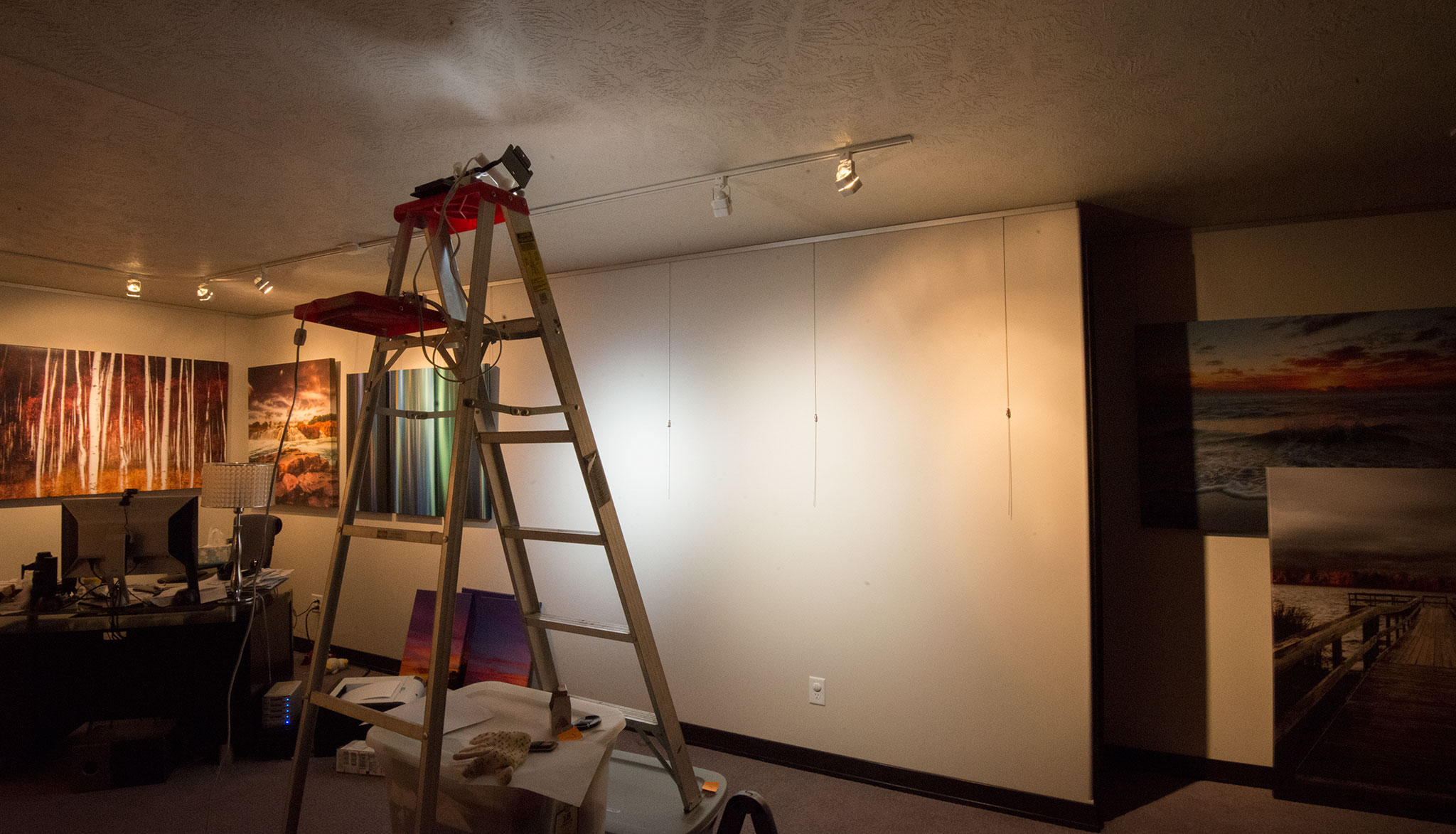
So let the experiment commence!
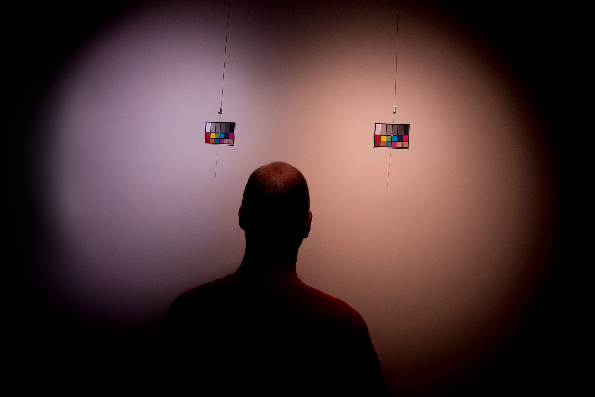
First, let's just look at how color temperature looks on a blank wall.
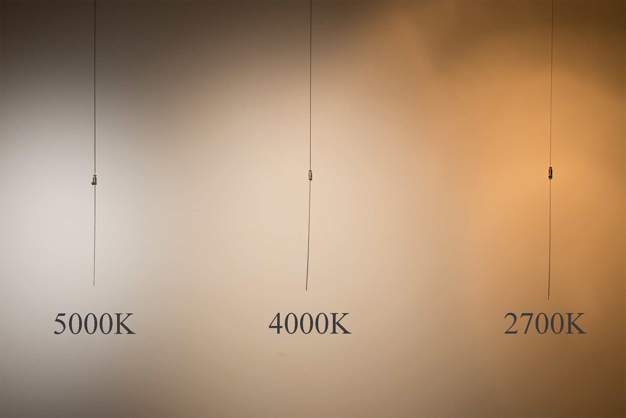
Seeing the vast difference in color temperature on a blank wall is kind of shocking, isn't it?
Most lights these days still fall in the 2700-3000K range. It's "warm" light. When I look at it, I can quickly understand how the orange washes colors away. Yuck.
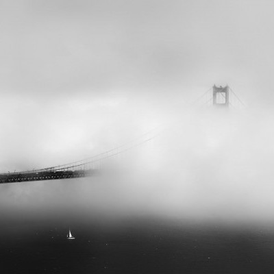
Well, let's pull out an artwork called ENVISION which has both neutral and warm tones mainly.
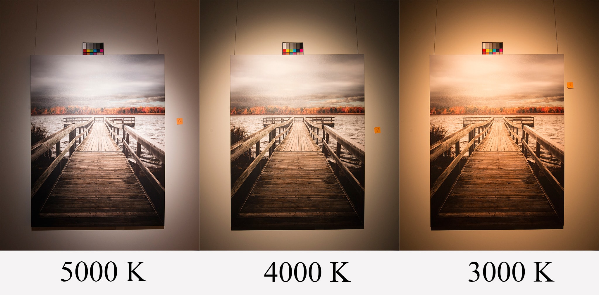
It's kind of crazy how different they are when you look at them right next to each other, isn't it?
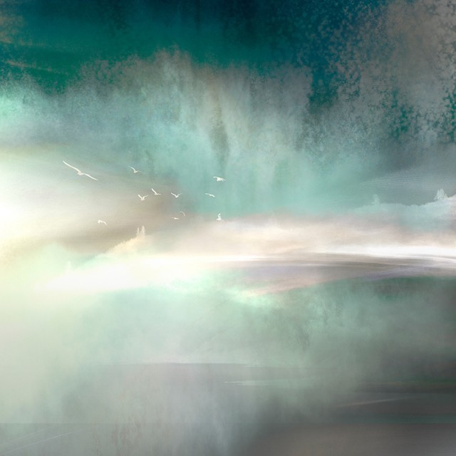
I then tried an abstract image called GRAFFITI which hosts lots of different colors with a lot of contrast. There's white, black, and numerous color tones, both warm and cool.
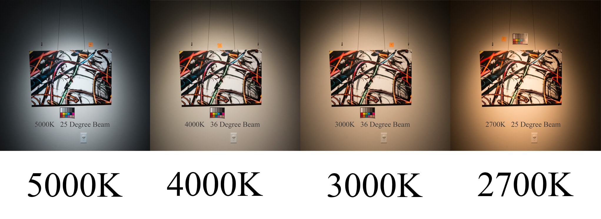
The difference in the white clobbers you right over the head.
Let's look closer and really see what's happening here. The lower color temperatures are spraying the orange glow, altering the appearance of the white, that's for sure. Worse, it seems to be compressing the color spectrum making even the cool blues move closer to orange. The pinks and yellows are the most noticeable.
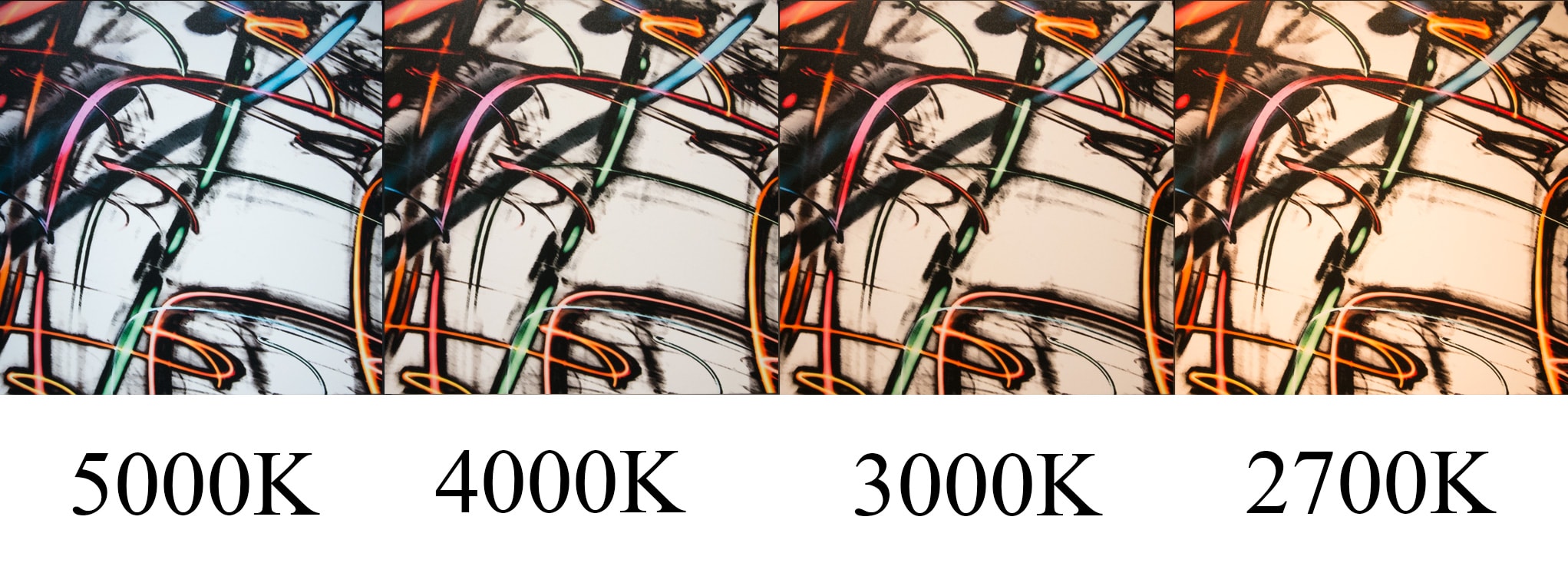
At this moment of testing, I am SO glad to be seeing this in real life. These results are astonishing.
So let's pull out another nature scene that has some pastels and cooler tones as well and see what it does.
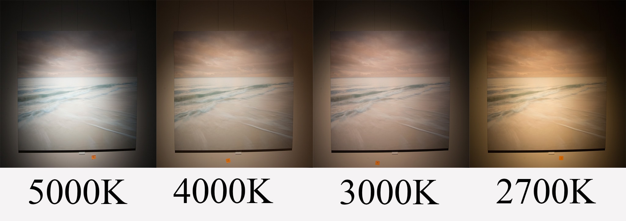
The 2700K just looks like a mess, while the 5000K looks a bit too cold. The middle temperatures are the clear winners.
After testing these and several other artworks, the results became crystal clear.
The winner is 4000K. The biggest difference came in the pureness of the white time after time. It held it nicely while keeping the colors vibrant and separate from each other. At times, the 5000K almost seemed too harsh and cool. This is despite that, technically, 5000K is closer to "natural white" in nature. It's the mere fact that our eyes don't like the harsh brightness of this color temperature and is why we prefer sunglasses.
But wait! There's more.
What about beam angle? Given the exact same position of the lamp, even beam angle affects the color of the artwork pretty substantially.
The image on the left is a 36-degree beam angle while the image on the right is a 25-degree beam angle.
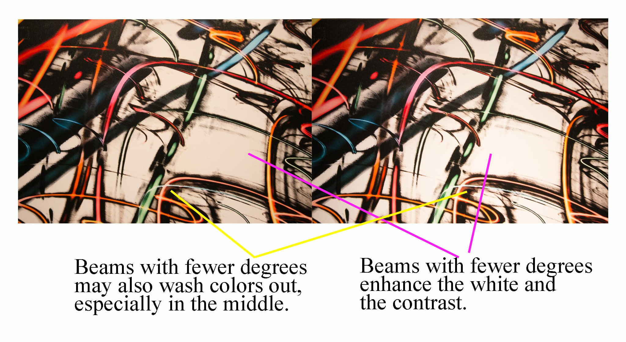
It makes sense. A wider beam spreads out a softer light, while a focused narrow beam produces a harsher, more severe light.
So again,
I'm going with a 36 degree CRI 95 R9 95 4000K SORAA "Vivid" lamp. Winner winner chicken dinner.
I want to extend a special thanks to Jerry Kraft and Ray Campbell from JTH Lighting for allowing me to take home a kit with all kinds of lamps to really see these differences. They talked me through their experiences working with different brands of lamps. I went straight to the top of their list because I wasn't messing around.
There are so many elements that play a part in displaying amazing artwork. I'm a little crazy when it comes to these things, but rest assured, I will continue to share anything and everything I can to help your artwork look its best.